1. The Artistic Vision
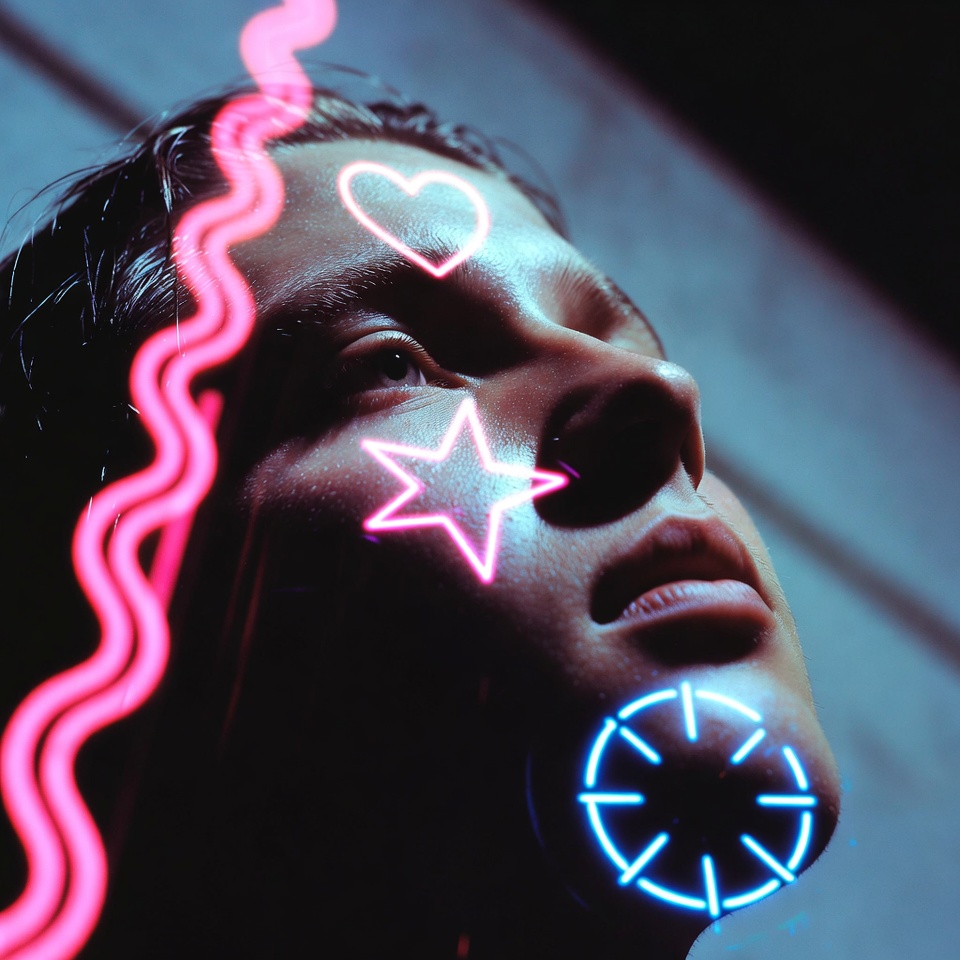
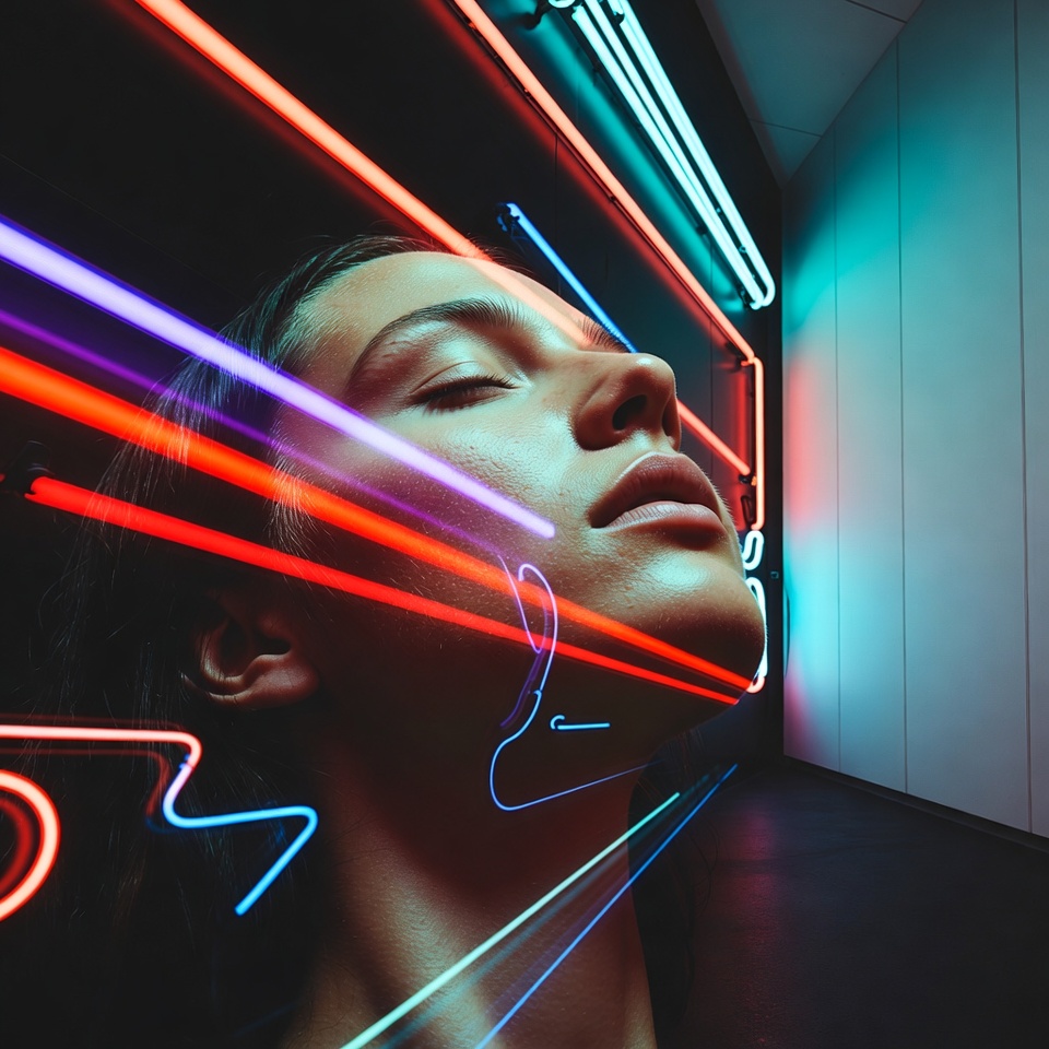
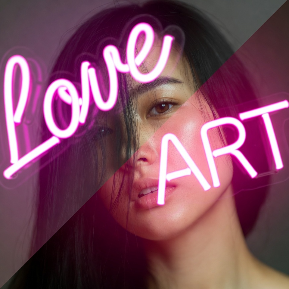
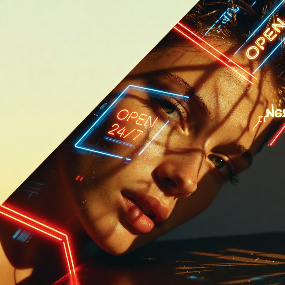
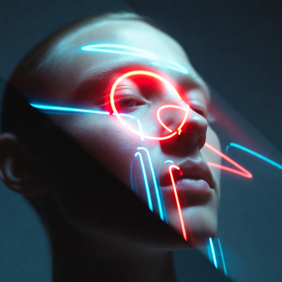
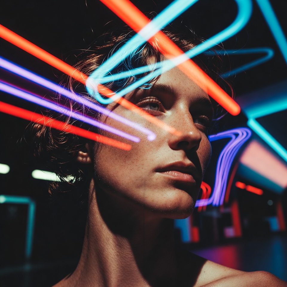
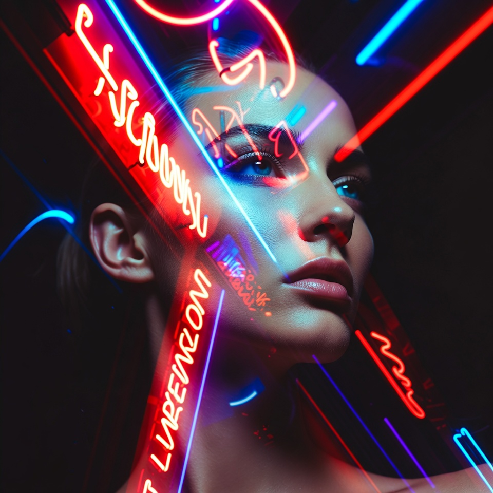
Double Exposure is controlled ambiguity: two visual truths occupying the same frame identity overlaid with environment, memory fused with architecture, a person becoming a place. When the overlay source is Neon Signs, the composite instantly reads futuristic because neon carries a built-in language of tech, nightlife, and synthetic color.
Add a Dutch Angle and Diagonal Composition and you get propulsion. The frame stops feeling observational and starts feeling kinetic like the subject is mid-transmission, mid-escape, mid-upgrade. Futurism here isn’t just “sci-fi props”; it’s geometry, velocity, and luminous data-like color slicing through the portrait.
2. The Master Prompt (Copy-Paste Ready)
3. Anatomy of the Shot (Technical Deep Dive)
Why this Lighting? (Neon Signs)
Neon is practical light with spectral authority high saturation, strong hue identity, and immediate scene-setting.
- Color-coded futurism: cyan/magenta/acid green read as synthetic and electronic, especially when layered into skin contours via double exposure.
- Edge energy: neon produces high-contrast highlight bands that survive blending and keep the composite readable.
- Place embedded in portrait: signage text shapes (without needing legible words) imply city density and technological ambience.
Control note: To avoid “radioactive skin,” push neon to behave like an overlay element (glow + bokeh + reflections) rather than a full-face wash.
Why this Angle? (Dutch Angle)
Dutch angle injects instability and intent perfect for futurism, where the world feels slightly off-axis.
- Disorientation as design: the viewer senses movement, disruption, or altered reality.
- Cinematic tension: it implies a narrative beat (danger, intensity, acceleration).
- Supports double exposure: the tilt helps separate layers by making the composite feel purposely constructed, not accidentally misaligned.
Why this Composition? (Diagonal Composition)
Diagonal composition is the structural backbone of “forward motion.”
- Vector-driven eye flow: the viewer rides the diagonal from corner to corner, which makes the composite feel like a data-stream or transit line.
- Layer hierarchy: diagonals help you assign roles one diagonal can be the subject silhouette, the opposing diagonal the neon-city overlay.
- Futuristic readability: strong diagonals mimic UI layout logic, holographic panels, and architectural lines.
Implementation: Place the main facial mass along a dominant diagonal, then let neon sign shapes or street reflections form a secondary diagonal in the opposite direction.
4. Color Palette & Aesthetics
Suggested Color Palette (Neon Futurism):
- Base: near-black / deep graphite
- Neon accents: electric cyan + hot magenta
- Optional third hue: toxic lime (use sparingly as a “signal” color)
Textures to expect (or encourage):
- Glow bloom / halation around neon edges
- Fine grain to keep gradients cinematic
- Glass, chrome, wet asphalt textures to create reflective repetition inside the exposure blend
5. Pro Tips for Refinement
Tip 1 (Stylization + Composite Control):
- If double exposure becomes muddy, reduce interpretive drift:
--stylize 75–150. - If you want bolder, more graphic overlays: keep
--stylize 200–300(250 is a strong default) and add optional cues like “high-contrast silhouette mask” or “clean double exposure separation.”
Tip 2 (Subject Matter):
- Choose a subject with a strong silhouette profile (distinct hair shape, coat collar, sharp jawline) so the overlay has a clear container.
- Futuristic wardrobe that doesn’t fight neon: matte black, minimal seams, reflective piping, or a single metallic accessory that catches glow.
6. FAQ (Rich Snippet Optimized)
Q: Can I use this prompt for a “cyberpunk” look instead of futuristic?
A: Yes swap “Futuristic” for “Cyberpunk” and intensify neon density (more signage, rain reflections), while keeping Dutch angle + diagonals for kinetic tension.
Q: What makes this composite feel futuristic rather than surreal?
A: The futurism comes from neon’s synthetic color signature, Dutch-angle instability, and diagonal vector flow they read like city-tech motion and UI geometry, not dream logic.