1. The Artistic Vision
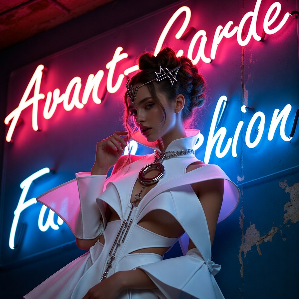
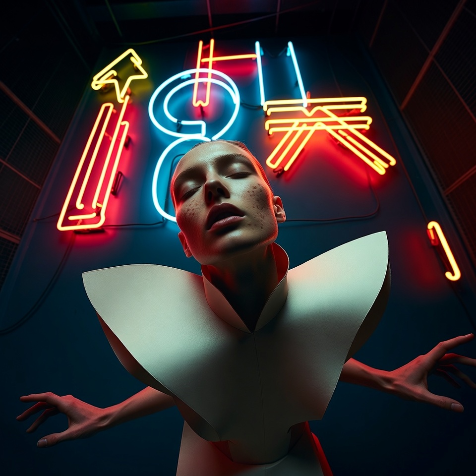
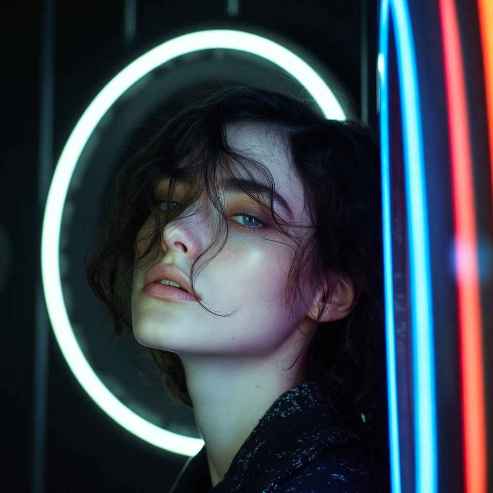
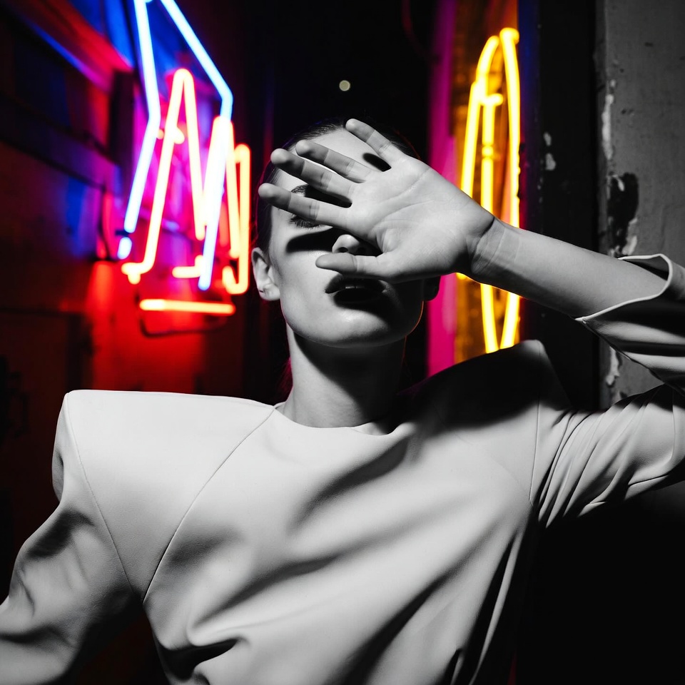
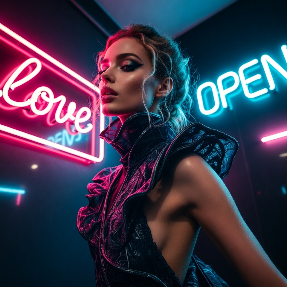
Avant-Garde Fashion thrives on controlled disruption silhouettes that challenge anatomy, styling that feels like sculpture, and images that look designed rather than merely captured. When the illumination is Neon Signs, the portrait inherits an urban electricity: saturated hues, luminous edge spill, and reflective highlights that turn textiles into liquid color.
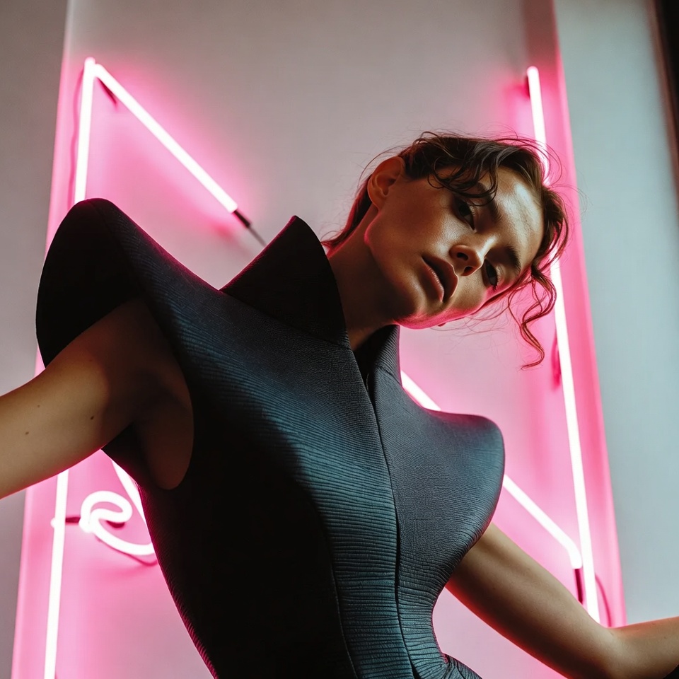
The twist is making that voltage feel Romantic. Romance here isn’t softness it’s seduction through color and symmetry: a warm-magenta halo across cheekbones, cyan shadows that imply night, and a centered, altar-like staging that elevates the subject into iconography. Add a Dutch Angle and the romance becomes destabilized like a love scene in a surreal city where everything is tilted just enough to feel dangerous.
With Center Symmetrical composition, the chaos is framed inside a deliberate structure. Symmetry is the “runway discipline” that keeps avant-garde from turning messy; the dutch tilt becomes a stylistic tension, not a mistake.
2. The Master Prompt (Copy-Paste Ready)
3. Anatomy of the Shot (Technical Deep Dive)
Why this Lighting: Neon Signs
Neon sign lighting is effectively colored practical light with strong saturation and localized falloff. It excels for avant-garde because it:
- Creates chromatic contouring: colored edge light defines sculptural garments, latex, metallics, and architectural hair shapes.
- Produces specular storytelling on glossy materials (vinyl, sequins, wet-look makeup), making fashion read “expensive” and futuristic.
- Encourages selective visibility some details glow, others vanish perfect for romance built on suggestion rather than full disclosure.
To keep it romantic instead of harsh club lighting: prioritize warm neon dominance (magenta/rose/amber) and let cool tones live in shadow rather than competing at equal strength.
Why this Angle: Dutch Angle
A dutch angle introduces intentional imbalance, which is a high-fashion staple:
- It adds kinetic energy to a static pose romance becomes “charged,” not serene.
- It makes symmetry feel uncanny: the subject is centered, but the world is off-axis, like love in a neon dream.
- It amplifies avant-garde silhouettes by turning straight lines (shoulders, collars, headpieces) into graphic diagonals.
Key control point: keep the face and eye line readable. The tilt should energize, not confuse.
Why this Composition: Center Symmetrical
Center symmetry is the perfect counterweight to a dutch tilt:
- It creates iconic presence the subject becomes the axis of the image.
- It stabilizes complex styling (asymmetric garments, extreme makeup) into a coherent editorial statement.
- It intensifies romance by making the viewer feel “locked in” with the subject direct, intimate, ceremonial.
A strong tactic: align the nose bridge and sternum to the vertical center, then let neon reflections form symmetrical color wings on both sides.
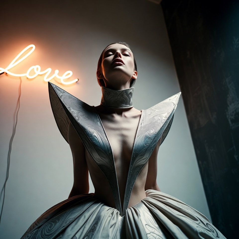
4. Color Palette & Aesthetics
Recommended Color Palette (romantic neon couture):
- Rose Magenta + Electric Violet + Soft Amber
- Shadow countertone: Deep Cyan (kept subtle) for cinematic depth
Textures to expect (and encourage):
- Gloss vinyl / patent leather reflections
- Metallic foil fabric shimmer
- Neon bloom/halation around highlights (tasteful, editorial)
- Fine grain to unify saturated gradients and prevent “digital flatness”
5. Pro Tips for Refinement
Tip 1 (Stylization):
- Midjourney:
- For sharper editorial realism and cleaner garment edges: set
--stylizeto 100–175. - For more avant-garde abstraction (bolder shapes, more graphic neon): push 300–500, but watch for melted jewelry/garment seams.
- For sharper editorial realism and cleaner garment edges: set
- Stable Diffusion:
- Use CFG 5–7 for believable fashion construction; go higher only if the model ignores “center symmetrical” and “neon signs.”
Tip 2 (Subject matter):
This setup performs best with subjects and styling that can “carry” geometry:
- Wardrobe: structured shoulders, sculptural collars, exaggerated sleeves, corsetry, asymmetrical couture layers
- Beauty: wet-look highlights, neon liner, glossy lips, reflective gemstones
- Romance cues that stay fashion-forward: soft gaze, parted lips, gentle hand-to-collar gesture (avoid broad smiles keep it intimate and editorial)
If “romantic” becomes too sweet, refine with direction like: “romantic tension, intimate gaze, couture elegance.”
6. FAQ (Rich Snippet Optimized)
Q: Can I use this prompt for Futuristic Streetwear instead of Avant-Garde Fashion?
A: Yes swap “Avant-Garde Fashion” for “futuristic streetwear” and keep neon signs + centered symmetry to preserve the editorial neon-romance structure.
Q: What creates the Romantic feeling in this shot?
A: Romance comes from warm neon dominance (magenta/amber), intimate eye-level emotional cues despite the tilt, and centered symmetry that makes the subject feel iconic and close.