1. The Artistic Vision
High-End Editorial is about control that looks effortless: immaculate styling, purposeful lighting, and compositional decisions that feel like a magazine cover even when the subject isn’t facing the lens. When you combine that with Butterfly Lighting, you inject a beauty-grade polish clean facial architecture, refined tonal transitions, and a premium “studio authority.”
Now twist it futuristic: sleek materials, minimalism, and a hint of engineered design language. The Back View becomes a power move identity turned into silhouette, the subject reduced to form and couture geometry. Diagonal Composition then breaks the “catalog symmetry” and turns it into momentum: the frame feels like fashion in motion, not fashion on display.
2. The Master Prompt (Copy-Paste Ready)
3. Anatomy of the Shot (Technical Deep Dive)
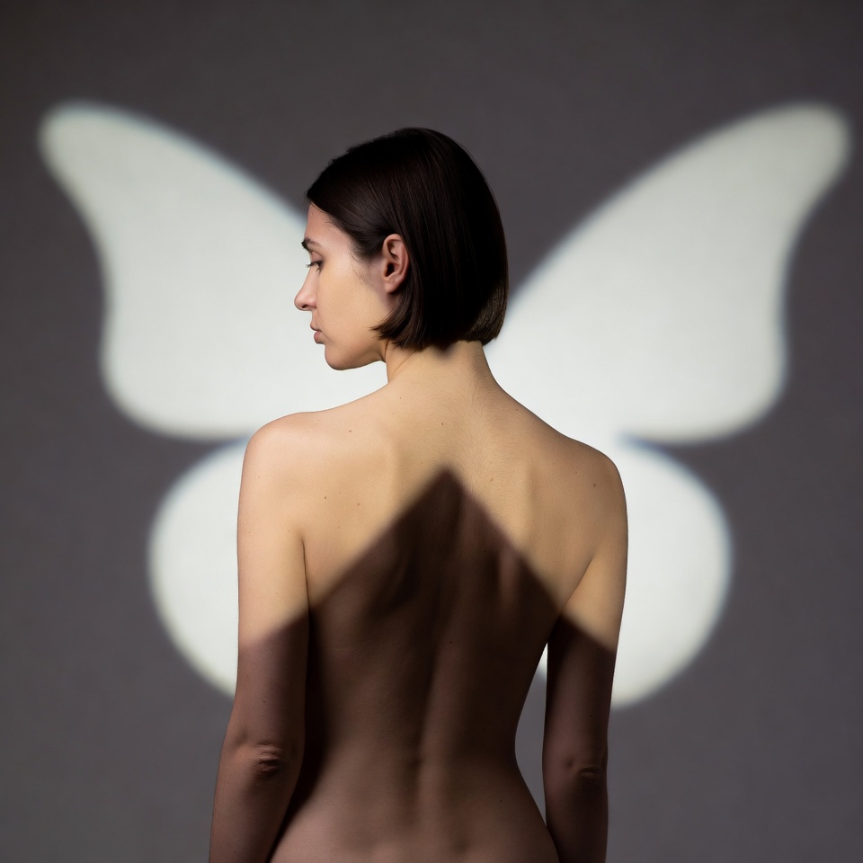
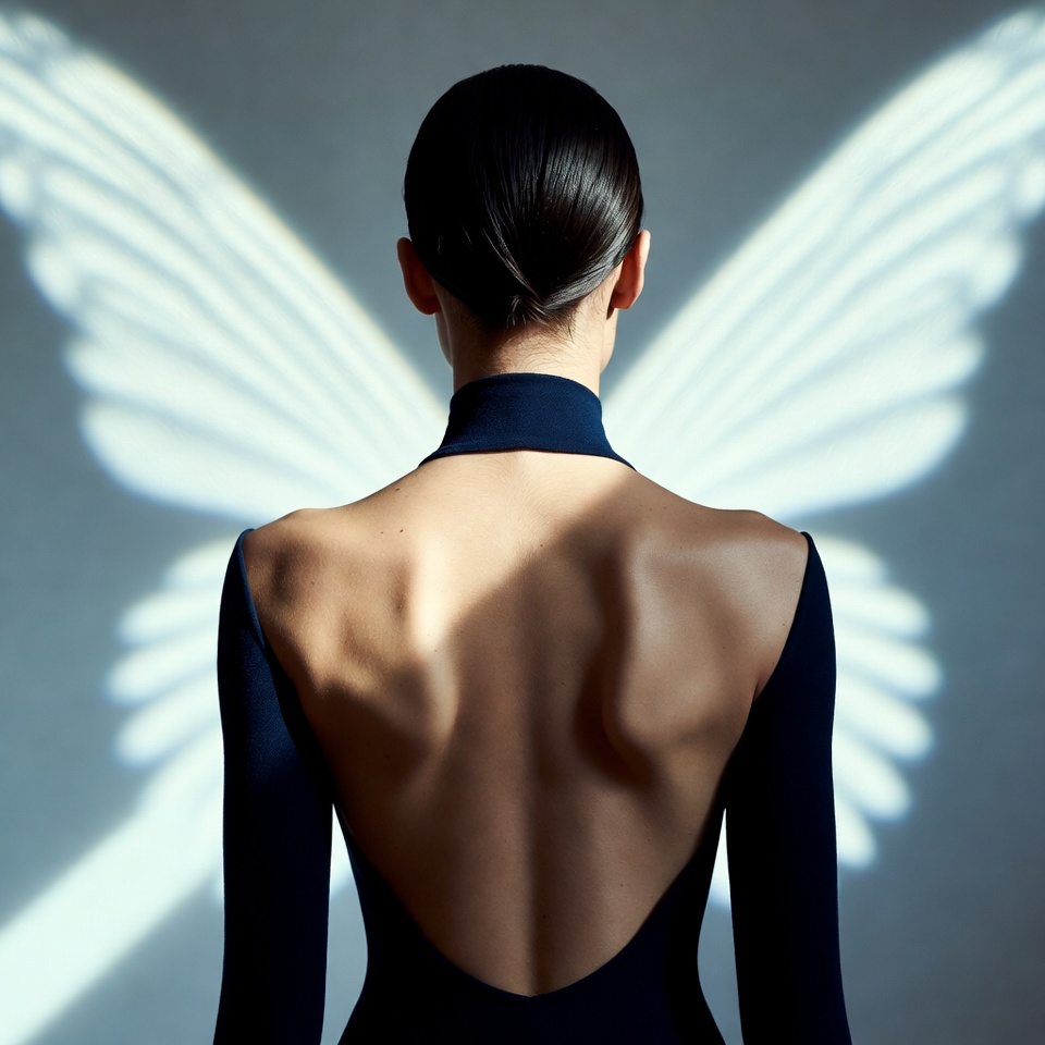
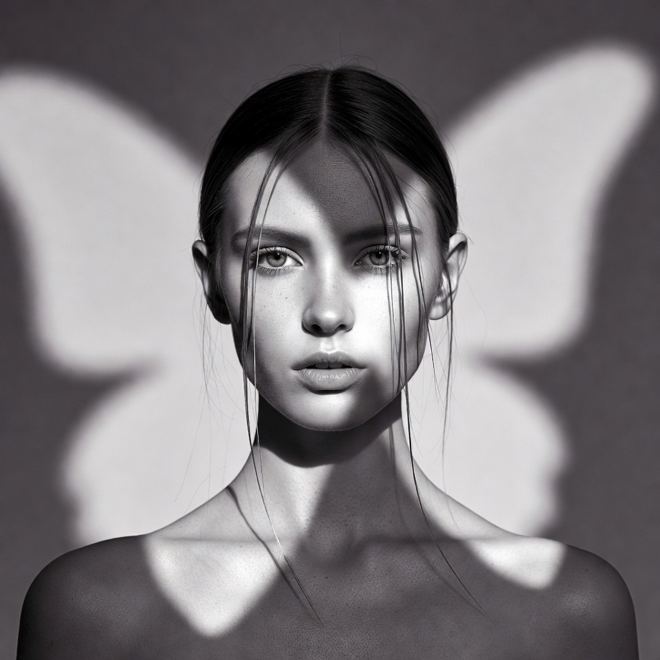
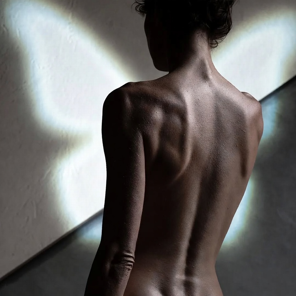
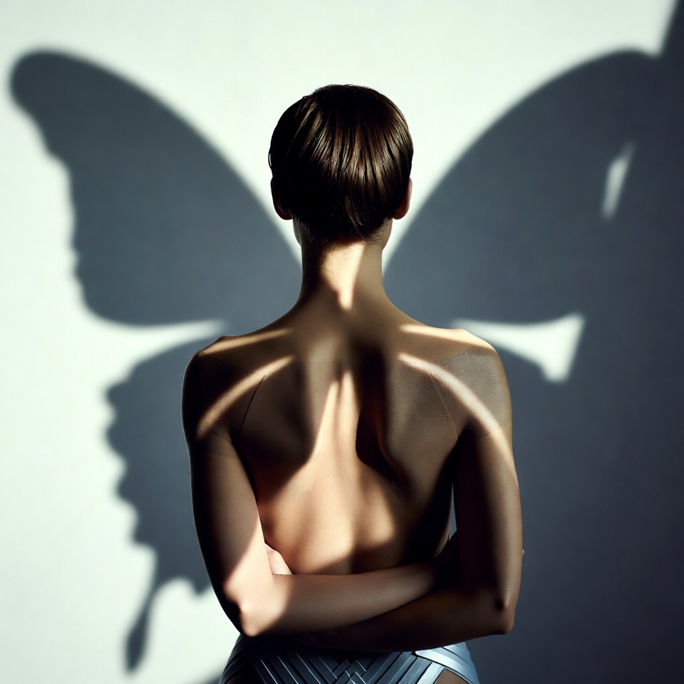
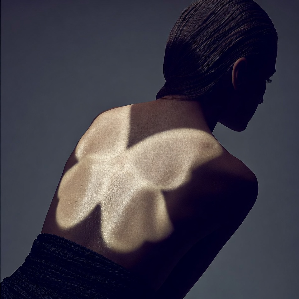
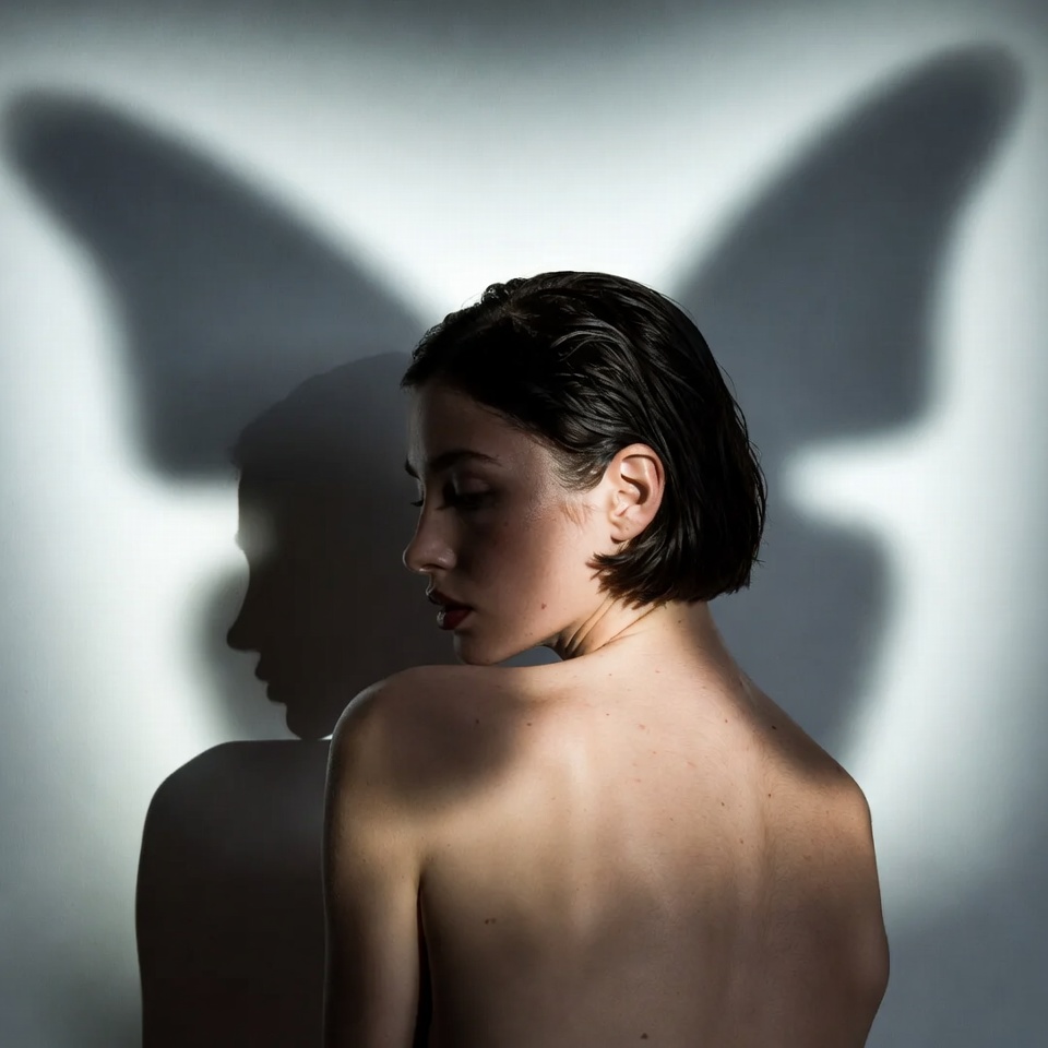
Why this Lighting? (Butterfly Lighting)
Butterfly lighting is traditionally a front-facing beauty setup, but in editorial work it’s really a centered, elevated key that creates pristine definition and controlled shadow behavior.
Even with a back view, it still matters because it:
- Elevates specular discipline on hair and wardrobe (especially glossy futurist materials).
- Keeps highlights centralized and “intentional,” preventing random side-hotspots that feel amateur.
- Builds studio polish a hallmark of high-end editorial by maintaining a clean, repeatable light logic.
Editorial hack: Add a subtle rim or kicker (implied, not stated) via reflective set pieces; you keep the butterfly “beauty” intention while giving the back-view silhouette separation.
Why this Angle? (Back View)
Back View is couture-forward:
- Turns wardrobe into the protagonist: seams, collars, structural shoulders, and engineered silhouettes become the narrative.
- Creates mystique: futurism thrives on anonymity identity as design object.
- Makes the image feel “campaign”: less portrait, more concept.
Pose cue: A slight head turn (still back view) plus a long neck line reads premium instantly.
Why this Composition? (Diagonal Composition)
Diagonal composition is the antidote to static luxury.
- Energy and directionality: diagonals imply motion, advancement, and technology perfect for futuristic editorial.
- Line economy: you can build the entire frame from a few dominant vectors (shoulder line, coat edge, light beam, set architecture).
- Stronger hierarchy: the eye travels along the diagonal to the brightest highlight region, then back across the silhouette.
Implementation: Use the subject’s shoulder line or coat lapel as the primary diagonal, then echo it with a secondary diagonal in the background (light strip, architectural edge).
4. Color Palette & Aesthetics
Suggested Color Palette (Futuristic Luxury):
- Base: obsidian black, graphite, platinum gray
- Accents: cool white highlights + a single “tech” hue (choose one)
- electric cyan or sterile violet or acid lime (sparingly)
Textures to expect (or encourage):
- High-sheen satin / latex-like gloss (tasteful), brushed metal, technical knit, matte neoprene
- Ultra-clean gradients (no muddy noise) with optional micro-grain for print realism
5. Pro Tips for Refinement
Tip 1 (Stylization):
- For stricter “real magazine studio,” reduce:
--stylize 75–150. - For more conceptual runway energy, keep
--stylize 200–300(250 is a strong editorial default). - If details get too ornamental, add optional cues like “minimal futurist design” or “clean lines, no busy patterns.”
Tip 2 (Subject Matter):
- Best subjects are defined by silhouette engineering: strong shoulders, long coat lines, sculptural hair, minimalist helmets/hoods (tasteful).
- Futuristic props that still feel editorial: light panels, reflective acrylic, metallic set walls use one signature element, not a collage.
6. FAQ (Rich Snippet Optimized)
Q: Can I use this prompt for a front-facing cover shot instead?
A: Yes swap “Back View” for “front view” and keep butterfly lighting + diagonal composition for a cover-ready, futuristic editorial look.
Q: What makes this feel “High-End Editorial” rather than generic sci-fi?
A: The editorial feel comes from controlled studio lighting (butterfly logic), silhouette-first styling, and deliberate diagonal composition futurism is expressed through materials and geometry, not cluttered sci-fi props.