1. The Artistic Vision
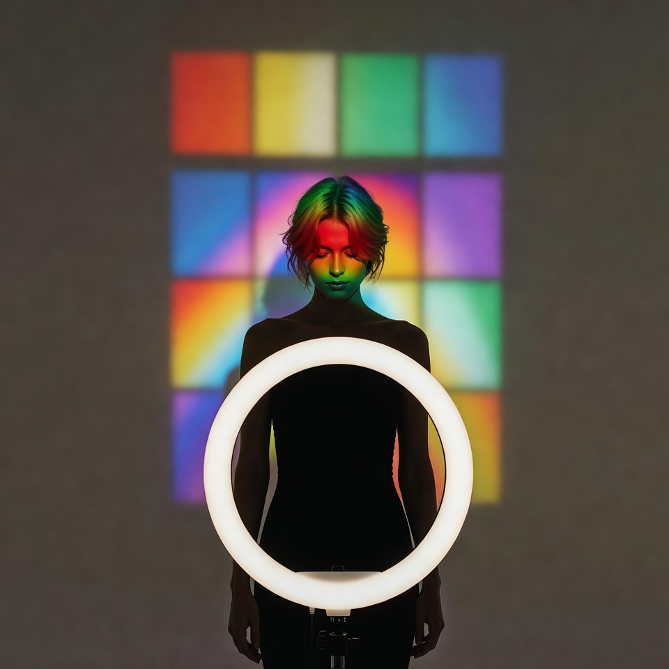
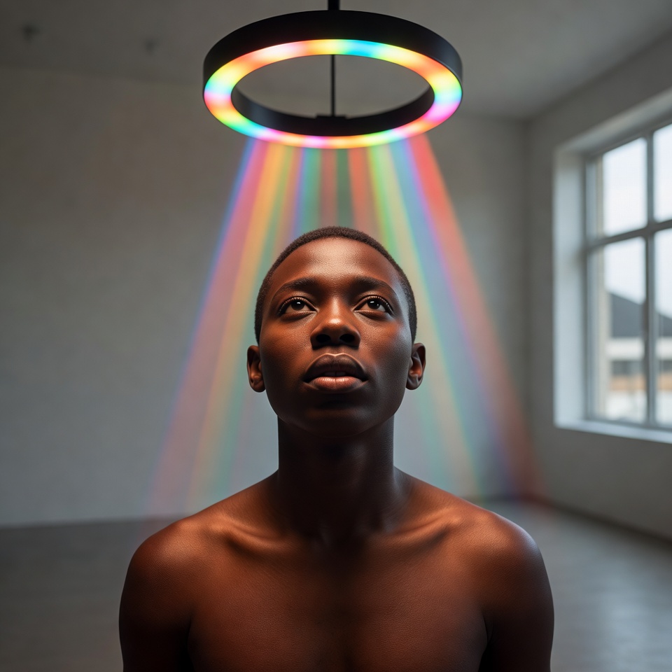
Technicolor is not “colorful.” It’s engineered color: saturated primaries, clean separation between hues, and a polished, almost theatrical density. On paper, that sounds like the enemy of Melancholic until you pair it with the right optics and light discipline.
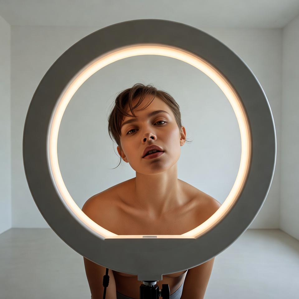
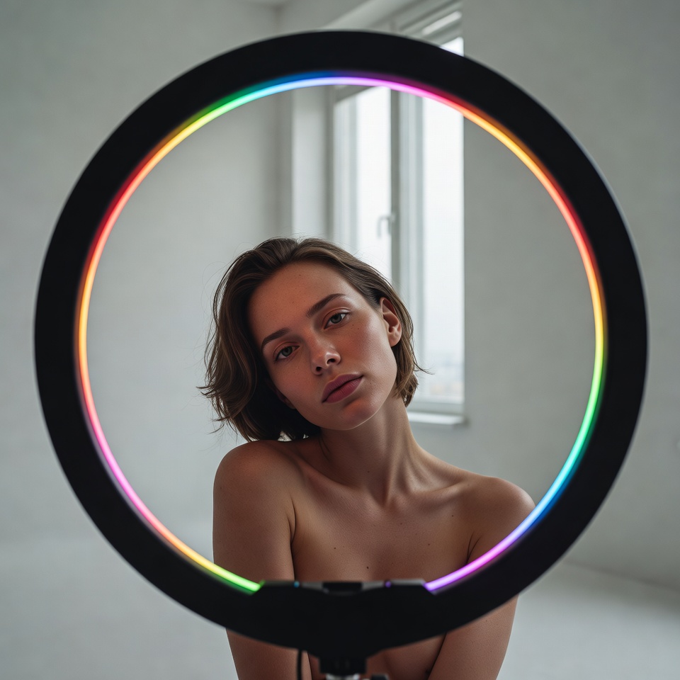
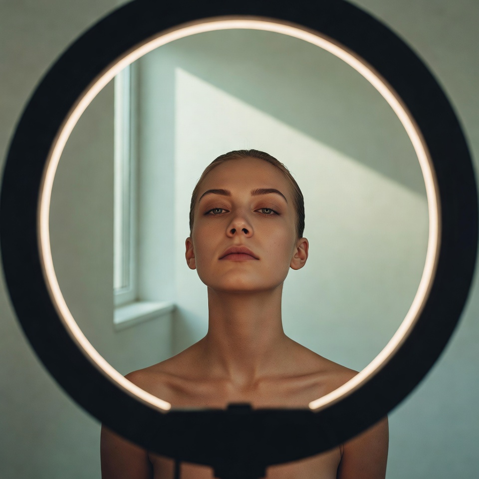
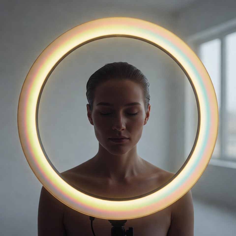
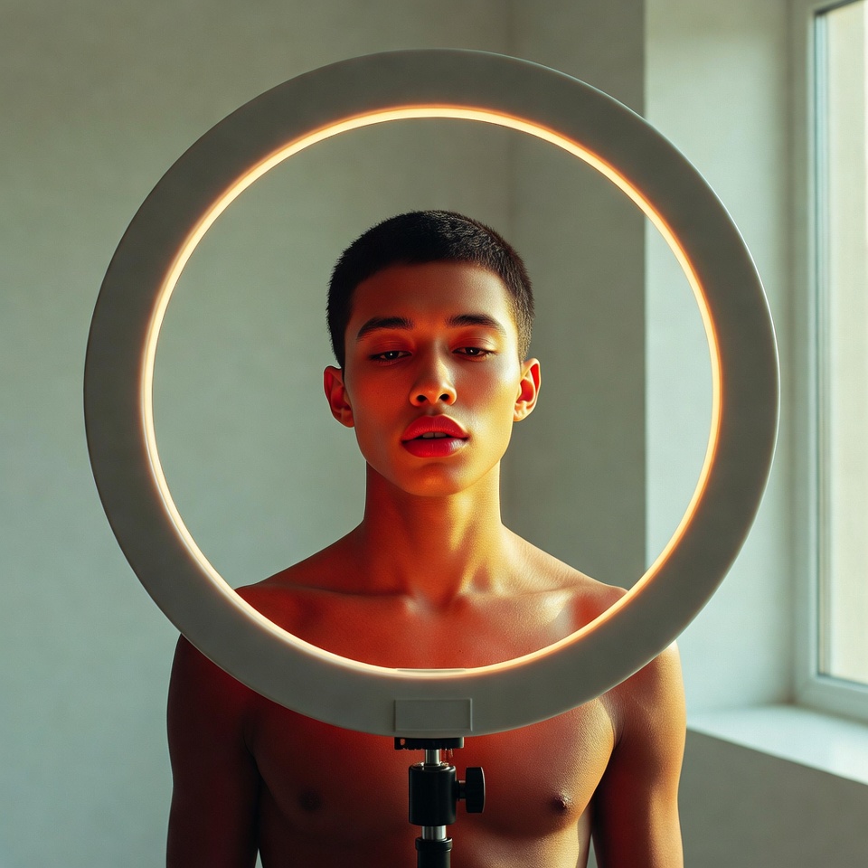
A Wide Angle 24mm introduces spatial loneliness: more environment, more negative space, and a subtle physical distance that can make the subject feel emotionally isolated even when they’re close to camera. Then Studio Ring Light adds a modern, clinical clarity catchlights like punctuation making the sadness feel intentional rather than messy. Finally, Minimalist composition strips distractions, leaving only the subject and the color logic. The result is a paradox that works: high-chroma melancholy bright hues carrying quiet weight.
2. The Master Prompt (Copy-Paste Ready)
3. Anatomy of the Shot (Technical Deep Dive)
Why this Lighting: Studio Ring Light
Ring light is near-axis illumination, meaning it sits close to the camera’s viewpoint:
- Even exposure + high detail retention: ideal for minimalist scenes where every imperfection is visible.
- Graphic catchlights: the circular highlights in the eyes read as modern and controlled useful for making melancholy feel designed.
- Reduced shadow complexity: keeps the frame clean, which supports “minimalist.”
Risk: Ring light can flatten facial structure. In a melancholic portrait, flattening can become emotionally “blank.” Counterbalance by prompting subtle shape cues: “soft side falloff,” “negative fill,” or “gentle shadow definition” when needed.
Why this Angle: Wide Angle 24mm
24mm portraits are psychologically potent because they can introduce:
- Spatial distortion (closer features feel slightly larger), increasing vulnerability and tension.
- Environmental context even in minimalist settings more wall, more air, more emptiness.
- A feeling of emotional distance: the subject can feel “alone in the frame” even when centered.
To keep it professional rather than accidental, the key is intentionality: “24mm editorial portrait,” “controlled perspective,” “natural proportions” (already in your base prompt) helps prevent exaggerated warping.
Why this Composition: Minimalist
Minimalism makes mood legible:
- Fewer objects = fewer competing meanings.
- Negative space becomes emotional space.
- Technicolor hues become the “set design,” so you can tell a story with a single backdrop and wardrobe block.
Minimalist + Technicolor works best when the background is one strong hue and the wardrobe is a complementary or contrasting primary.
4. Color Palette & Aesthetics
Recommended Color Palette: Technicolor Primaries with Controlled Density
- Crimson Red + Cobalt Blue + Butter Yellow (classic Technicolor triad)
- Keep one primary dominant, one supporting, one as a small accent to avoid chaos.
Melancholic color strategy (important):
- Maintain saturation, but reduce perceived “cheer” by using cooler dominance (blue/green leaning), and push shadows slightly toward teal/indigo while highlights stay clean.
Textures to expect:
- Smooth studio gradients (minimalist backdrops)
- Crisp eye detail and reflective highlights (ring light)
- Optional micro-grain if you want filmic nostalgia inside a modern lighting scheme
5. Pro Tips for Refinement
Tip 1 (Stylization / Realism Control):
- Midjourney:
- If Technicolor turns neon or “posterized,” reduce stylization:
--stylize 75–150. - If it looks too plain, raise:
--stylize 250–400while adding “cinematic color separation.”
- If Technicolor turns neon or “posterized,” reduce stylization:
- Stable Diffusion:
- Keep controlled realism with
cfg_scale ~ 4.5–7. - If skin becomes overly glossy, add “matte skin finish” or lower CFG slightly.
- Keep controlled realism with
Tip 2 (Subject Matter that carries melancholic energy):
- Expressions that read best in high-chroma sadness: soft gaze off-camera, relaxed mouth, slightly lowered chin, “quiet tension.”
- Wardrobe: one clean block of color (e.g., cobalt turtleneck, black suit with red lip).
- Minimal props: a single chair edge, a shadow line, or nothing at all melancholy needs space.
6. FAQ (Rich Snippet Optimized)
Q: Can I use this prompt for Film Noir instead of Technicolor?
A: Yes swap “Technicolor” for “high-contrast monochrome” and replace ring light with “hard key light” or “Rembrandt lighting” for stronger shadow narrative.
Q: What creates the Melancholic feeling in this shot?
A: The melancholy comes from wide-angle spatial isolation (24mm + negative space), controlled clinical clarity (ring light), and minimalist reduction that leaves expression and color-blocking as the only story signals.
