1. The Artistic Vision
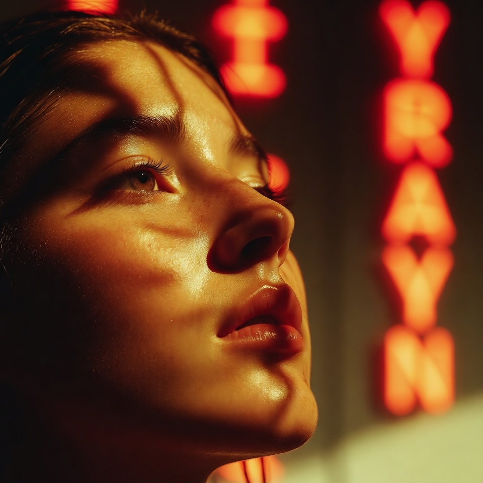
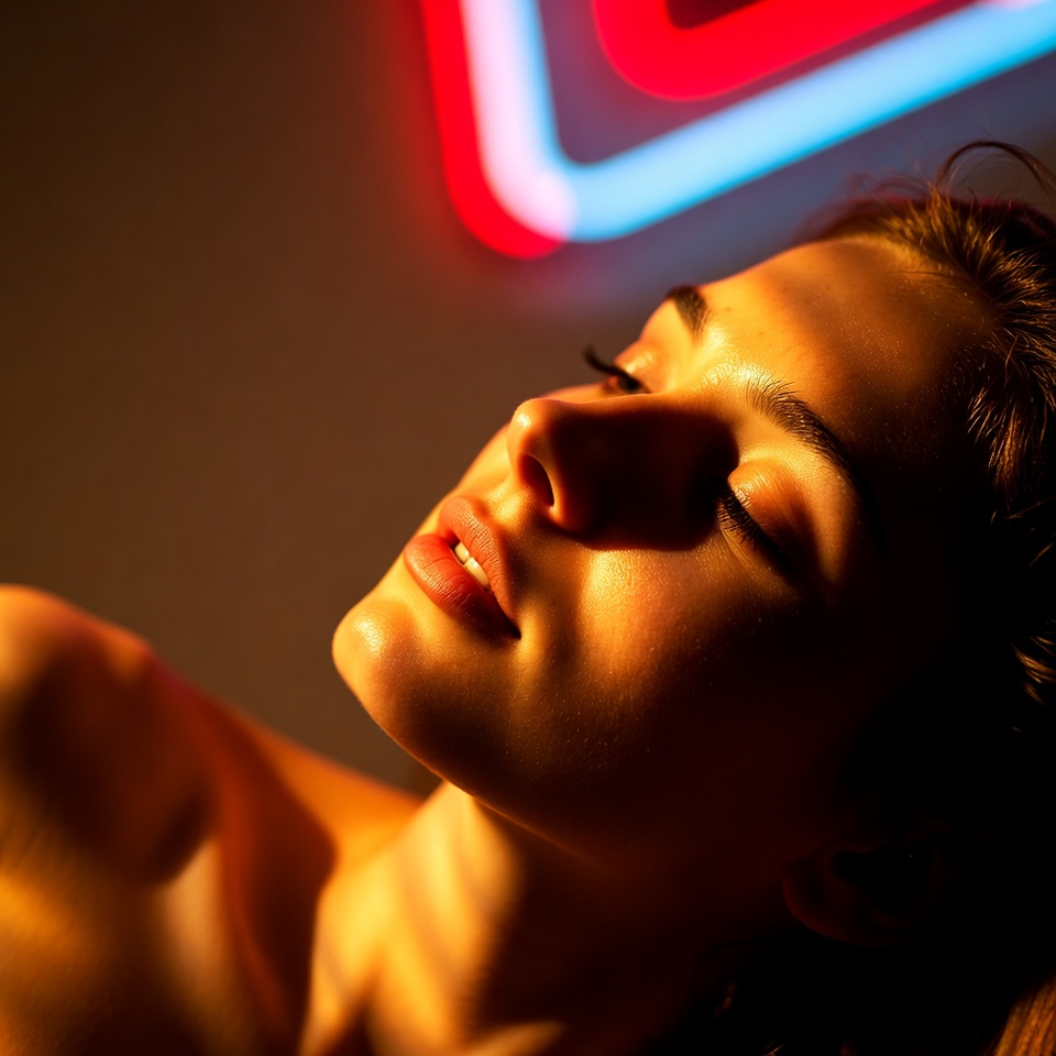
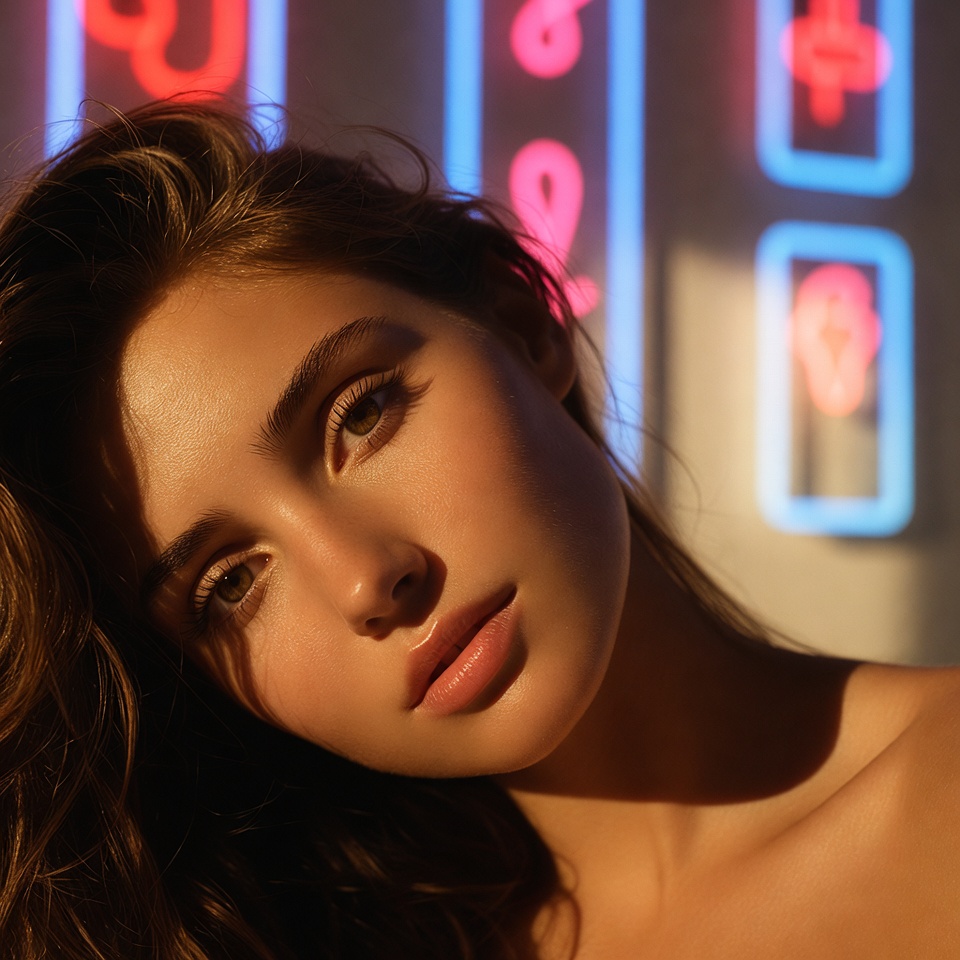
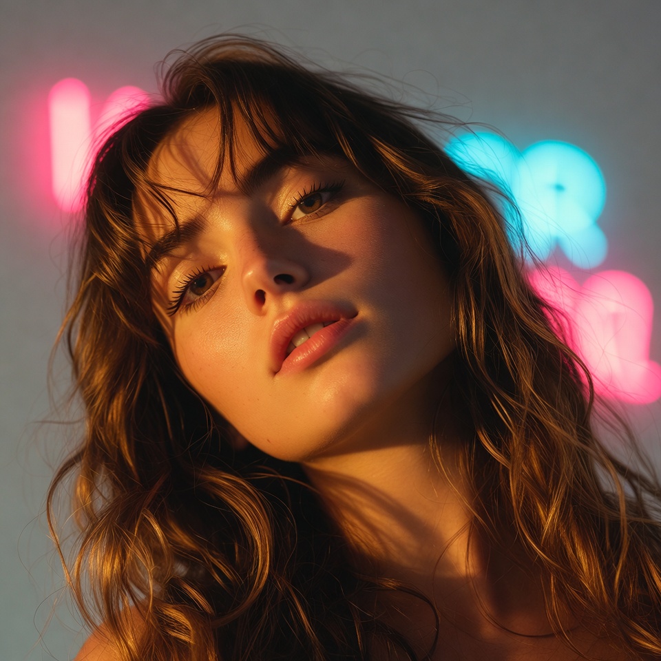
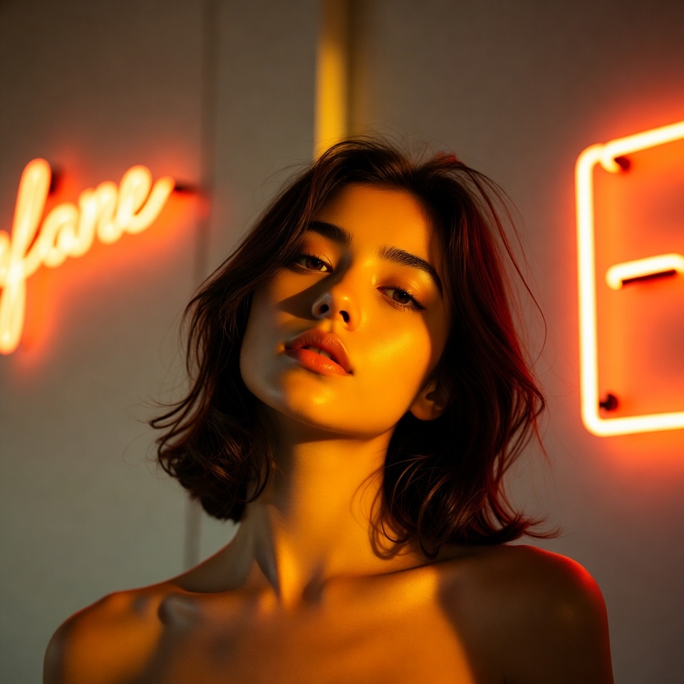
Golden Hour is romance by physics: low sun, warm spectral bias, and highlights that wrap skin with a soft, luminous mercy. When you introduce Neon Signs into that environment, you get a dual-light love story sunset warmth as the emotional baseline, neon color as the impulsive heartbeat. The image feels like a date that’s running long, the sky fading while the city turns itself on.
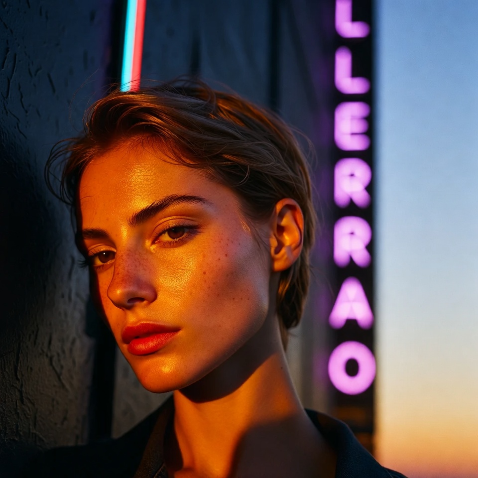
A Low Angle reframes romance as devotion and inevitability. It adds cinematic scale your subject becomes larger than the street, framed by glow and signage while Rule of Thirds prevents the shot from feeling like a poster. Instead, it feels like a real scene with air, context, and narrative space.
2. The Master Prompt (Copy-Paste Ready)
3. Anatomy of the Shot (Technical Deep Dive)
Why this Lighting? (Golden Hour + Neon Signs)
This is a two-source mood stack: warm natural key + colored practical accent.
- Golden Hour as the key light: creates flattering shadow roll-off and warm highlights on cheeks, nose bridge, and hair edges.
- Neon as the narrative light: adds localized color patches (magenta/cyan/green) that imply place late city, nightlife, intimacy.
- Romantic color contrast: warm/cool interplay reads as emotional tension: comfort (sunset) + excitement (neon).
Control note: If neon contaminates skin too heavily, prompt it as “subtle neon spill” or “neon bokeh in background” while keeping the sign presence.
Why this Angle? (Low Angle)
Low angle changes the psychology of the frame:
- Elevates the subject: romance becomes aspirational someone you look up to, literally and emotionally.
- Adds cinematic architecture: signage, sky gradients, and street lines become leading structures.
- Boosts glow: low angles catch more backlit hair and reflective surfaces, amplifying the golden rim effect.
Refinement cue: Keep it “low angle” but not extreme too low can feel heroic rather than romantic. Think “street-level admiration,” not “superhero.”
Why this Composition? (Rule of Thirds)
Rule of Thirds keeps the scene alive:
- Subject placement off-center creates longing and movement romance needs a little space to breathe.
- Neon becomes the counterweight: put the sign on the opposite third to balance the frame.
- Clean eye flow: viewer hits the subject first, then travels to the neon color and back.
Implementation: Subject on the left third, neon signage on the right third; leave upper third for the warm sky gradient.
4. Color Palette & Aesthetics
Suggested Color Palette (Sunset + Neon Romance):
- Honey gold / peach highlights
- Deep indigo / twilight blue shadows
- Neon accents: magenta-pink + electric cyan (or a restrained emerald)
Textures to expect (or encourage):
- Soft halation around neon and sun-kissed edges
- Light film grain (optional)
- Reflective street textures (wet pavement, glass, chrome) to multiply light sources
5. Pro Tips for Refinement
Tip 1 (Stylization):
- More documentary-real romance:
--stylize 75–150 - More dreamy, cinematic romance:
--stylize 200–350(250 is a strong default) - If highlights clip, add optional cues like “highlight roll-off” or “soft bloom,” rather than pushing stylize higher.
Tip 2 (Subject Matter):
- Romance reads through gesture: a subtle lean, hand holding, jacket shared, close proximity without overt posing.
- Wardrobe that harmonizes: neutral base (black/cream) so the golden hour and neon can paint it; avoid overly complex patterns.
6. FAQ (Rich Snippet Optimized)
Q: Can I use this prompt for a couple instead of a solo portrait?
A: Yes add “couple” or “two people holding hands” while keeping rule-of-thirds placement and letting neon act as a background practical light.
Q: What creates the Romantic feeling in this lighting setup?
A: Romance comes from golden hour warmth as a flattering key, neon color as atmospheric storytelling, and low-angle framing that makes the moment feel elevated balanced by rule-of-thirds space and breathing room.