1. The Artistic Vision
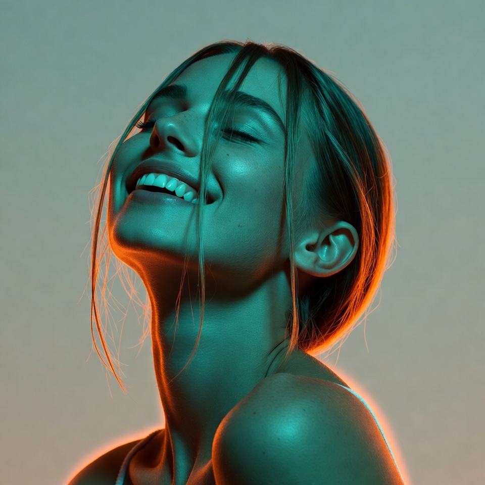
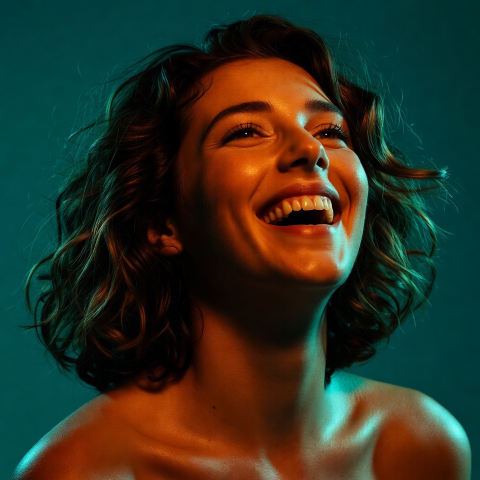
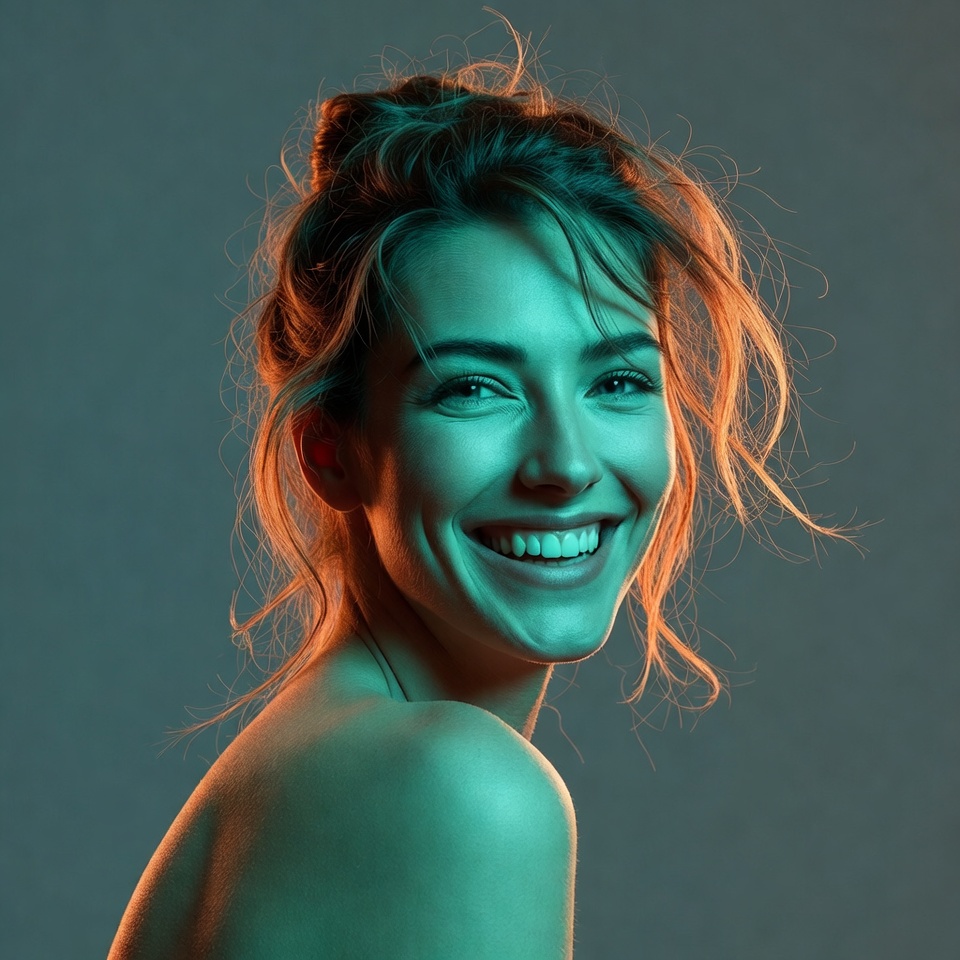
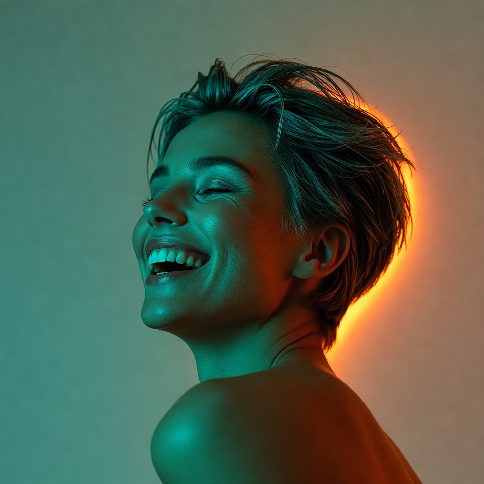
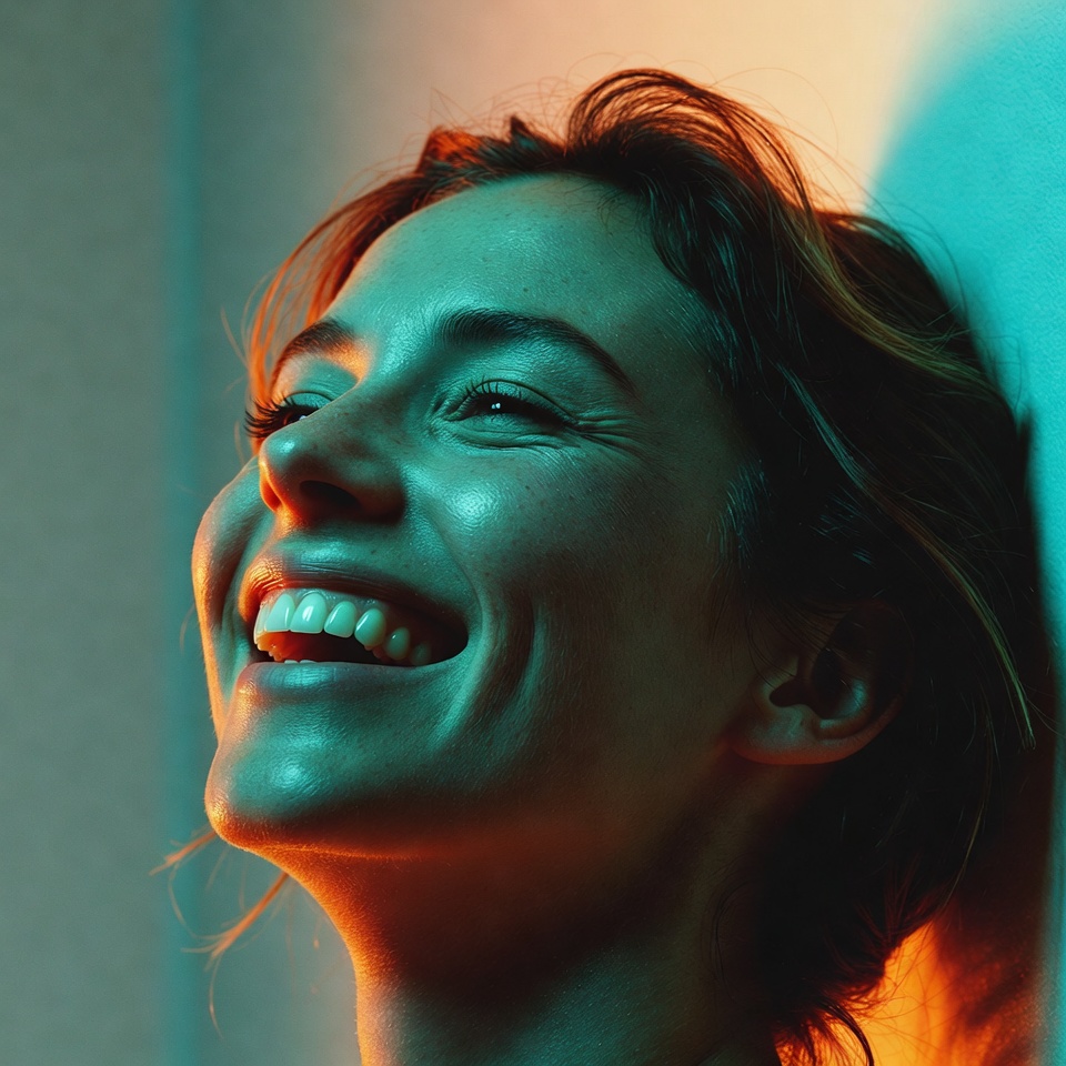
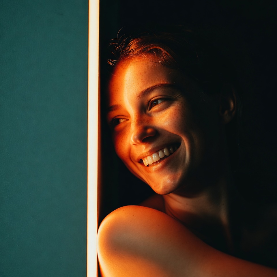
Blockbuster Teal & Orange is the visual shorthand of big-screen optimism: skin tones glow warm, shadows fall cool, and the entire frame feels engineered for emotional readability. When you add Rim Light (Backlight), you get that unmistakable cinematic separation an electric contour that lifts the subject from the background like a hero stepping into the spotlight.
The Over-the-Shoulder angle is the narrative accelerant. It implies a story in progress: we’re arriving mid-moment, catching a turn, a glance, a laugh that’s already happening. With the Rule of Thirds, the frame stays clean and intentional joyful doesn’t mean chaotic; it means brightly controlled energy.
2. The Master Prompt (Copy-Paste Ready)
3. Anatomy of the Shot (Technical Deep Dive)
Why this Lighting: Rim Light (Backlight)
A rim/backlight is a separation tool: it outlines the subject’s edges, creating a luminous boundary that reads as “cinematic production value.”
- Subject-background separation: The rim defines shoulders, jawline, and hair silhouette crucial for over-the-shoulder compositions where the shoulder can otherwise merge into the scene.
- Hero contour: Backlight suggests scale and spectacle; it feels like a key frame from a film.
- Joy amplification: Bright edge light reads as energetic and uplifting especially when paired with warm skin and clean highlights.
To keep it joyful (not ominous), the rim should be bright but not harsh think “sun-kissed edge” rather than “interrogation spotlight.”
Why this Angle: Over-the-Shoulder
Over-the-shoulder introduces implied context and a second “character”: the unseen space the subject is looking toward.
- Story cue: The viewer feels like they’re part of the scene, not just observing a portrait.
- Motion and spontaneity: Joy reads better when it feels captured, not staged. OTS angles naturally suggest a candid turn or shared moment.
- Flattering structure: The shoulder acts as a foreground framing element, giving depth and a cinematic layering effect.
Why this Composition: Rule of Thirds
The Rule of Thirds is what makes blockbuster color grading feel expensive instead of gimmicky.
- Place the eye line near an upper third intersection to lock attention instantly.
- Use the shoulder mass to occupy a lower third, creating a stable base.
- Reserve a third for negative background (even minimal) so the rim light has room to “glow” without clutter.
4. Color Palette & Aesthetics
Recommended Color Palette (Blockbuster Teal & Orange):
- Cinematic Teal (#1FA6A8) in shadows/background
- Skin-Warm Orange (#F2A15B) in highlights and midtones
- Deep Navy (#0B1B2B) for contrast depth
- Soft Gold (#F6D27A) for joyful highlight rolloff
Textures to expect:
- Clean cinematic clarity with controlled micro-contrast
- Subtle film grain (optional, helps it feel “shot,” not rendered)
- Specular hair highlights enhanced by rim light
- Smooth background gradients (keeps attention on expression)
5. Pro Tips for Refinement
Tip 1 (Stylization):
- If the image starts looking like a stylized poster rather than a cinematic still, reduce: –stylize 75–150.
- If you want stronger “blockbuster grading” and bolder teal/orange separation, increase: –stylize 300–450.
(Stable Diffusion equivalent: keep cfg_scale moderate; apply teal/orange via color grading or LUT-like workflows rather than forcing it with extreme prompt weights.)
Tip 2 (Subject Matter):
- Best subjects for joyful OTS: expressive eyes, visible smile lines, dynamic hair movement, fashion with a warm-toned highlight surface.
- Wardrobe: neutrals or warm accents (tan, rust, cream) so skin and orange highlights stay coherent; avoid highly saturated reds that fight the orange grade.
- Action cue: add a “laughing glance back” vibe by describing posture in a single phrase (optional), keeping it tasteful and natural.
6. FAQ (Rich Snippet Optimized)
Q: Can I use this prompt for “Action Movie” instead of Joyful?
A: Yes swap “Joyful” for “Intense” or “Determined,” and keep rim light + teal/orange grading; it will immediately read like an action still.
Q: What creates the Joyful feeling in this shot?
A: Joy is driven by warm highlight bias (orange) on the face, uplifting rim light separation, and the over-the-shoulder narrative cue that suggests a shared moment while the rule of thirds keeps the energy clean and cinematic rather than chaotic.