1. The Artistic Vision
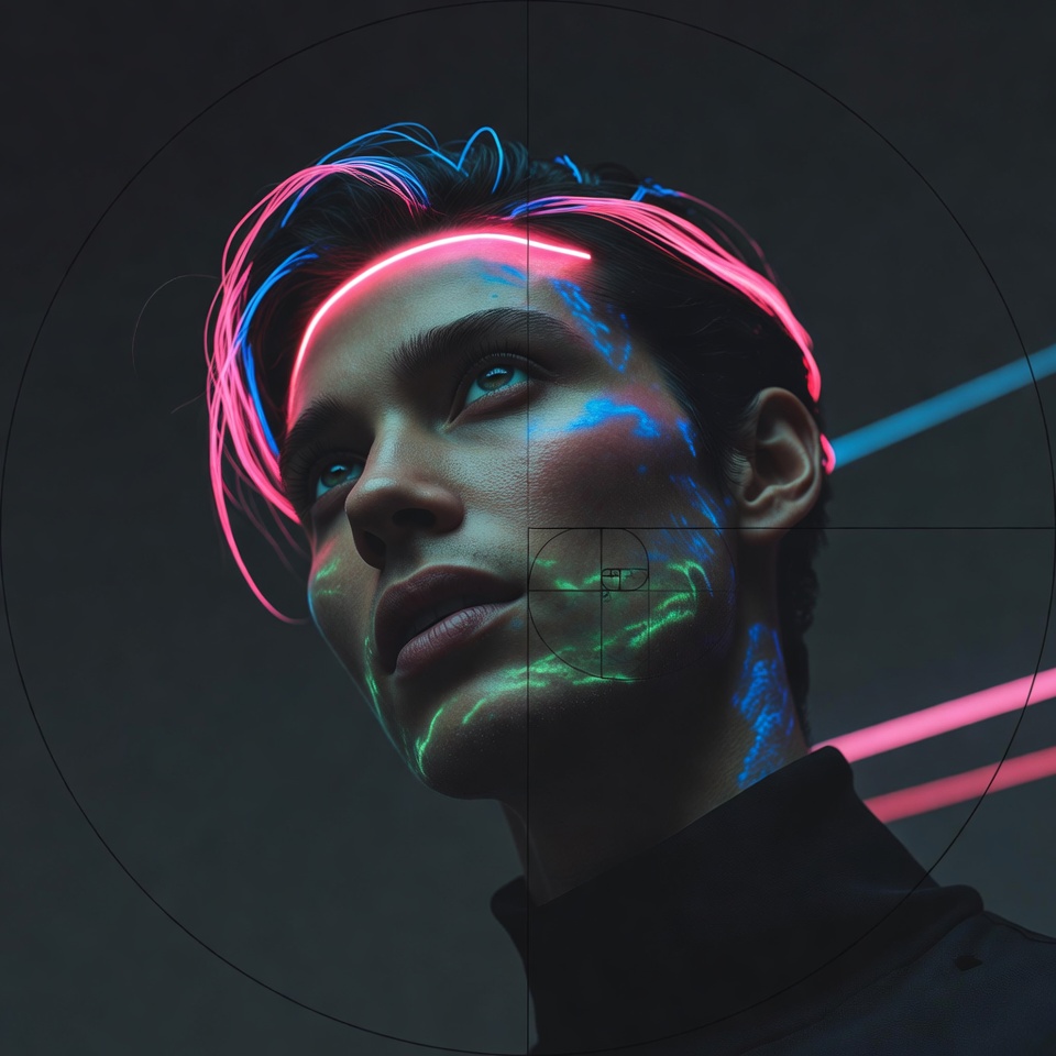
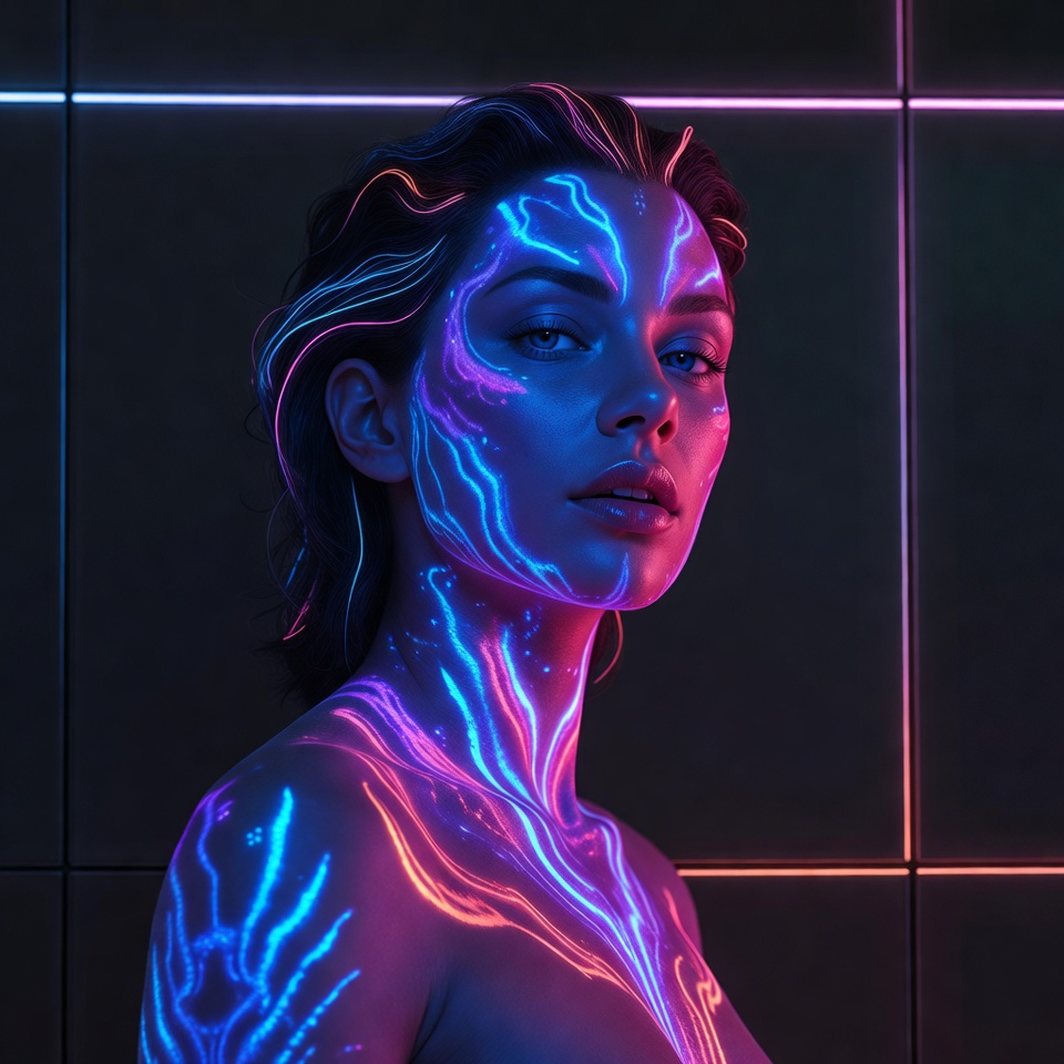
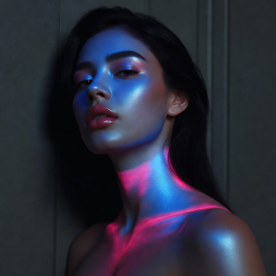
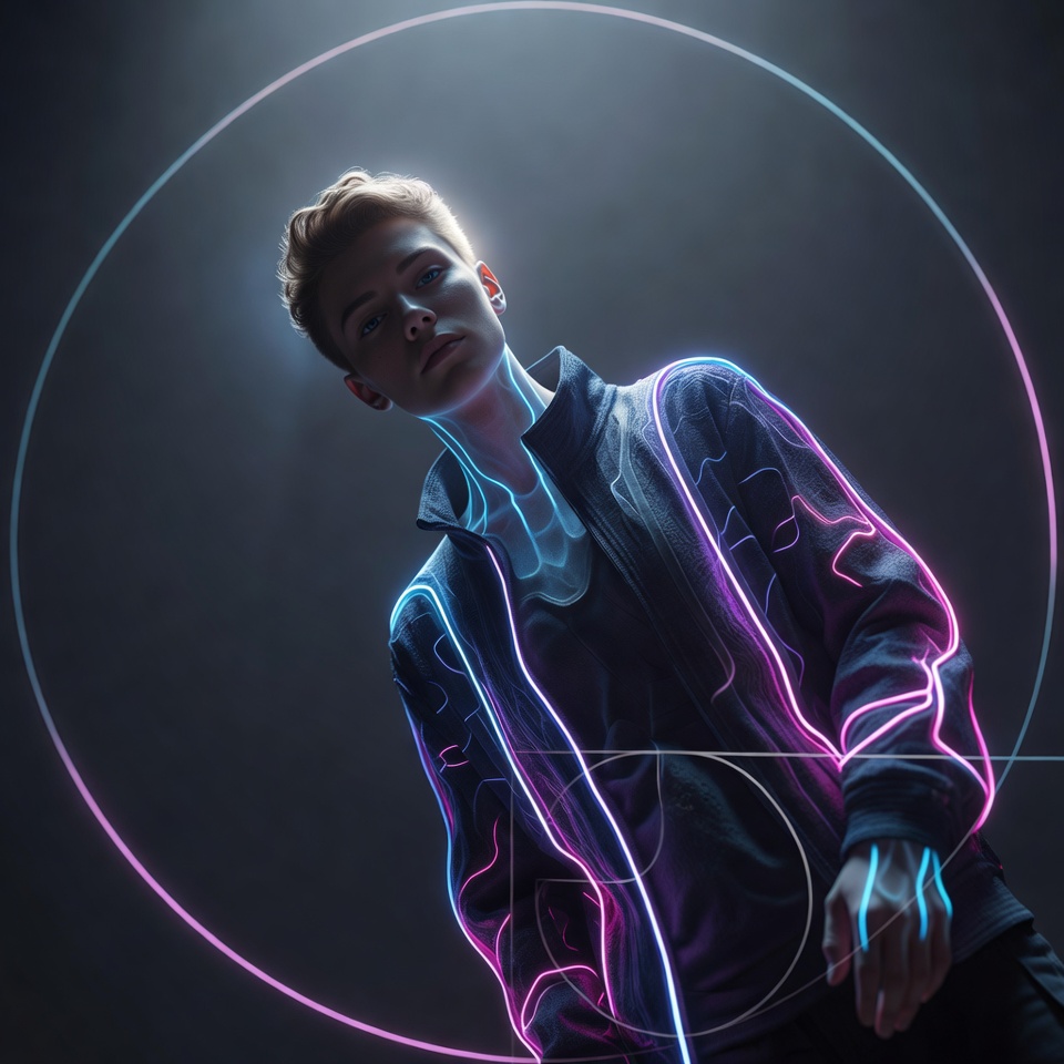
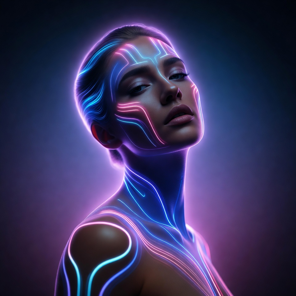
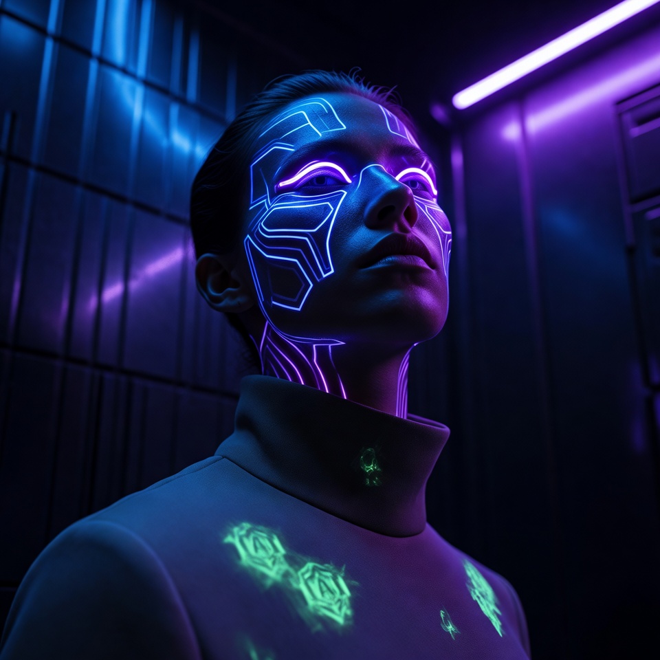
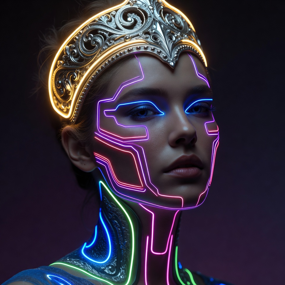
Cyberpunk Neon is often mistaken for “just bright lights.” In reality, it’s a controlled spectrum high chroma edges, disciplined contrast, and color separation that makes skin, metal, and atmosphere read in distinct layers. Add Bioluminescent Glow, and the neon stops feeling like signage; it becomes alive, as if the light is emitted by the subject and their environment rather than placed on it.
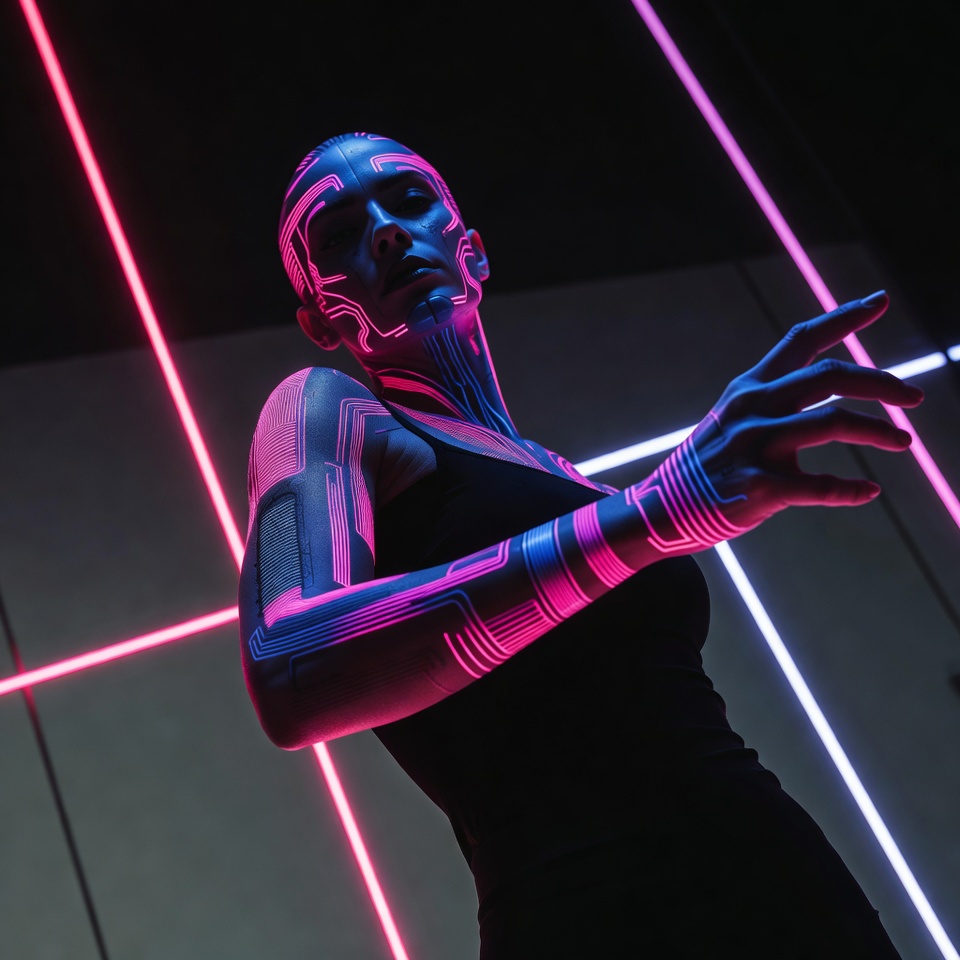
A Dutch Angle introduces tension and velocity diagonal energy that suggests motion, surveillance, or an unfolding narrative. To keep this from tipping into chaos, Golden Ratio composition provides structural intelligence: the frame feels art-directed and premium, even when it’s tilted. The mood Professional lands when the glow is precise, the highlights are preserved, and the geometry is intentional cyberpunk, but brand-grade.
2. The Master Prompt (Copy-Paste Ready)
3. Anatomy of the Shot (Technical Deep Dive)
Why this Lighting: Bioluminescent Glow
Bioluminescent glow behaves like an emissive material: light appears to originate from skin accents, textiles, gels, or atmospheric particles.
- Edge definition without harshness: glow creates soft gradients that still describe facial planes.
- Premium “tech” readability: emissive highlights feel engineered great for professional polish.
- Layered depth: glow in haze creates separation (foreground subject vs ambient neon fog).
Critical control point: keep the glow “clean.” Ask for controlled bloom so the face doesn’t melt into neon soup.
Why this Angle: Dutch Angle
Dutch angle changes psychology instantly:
- Feels dynamic and modern, ideal for cyberpunk energy.
- Suggests systems and surveillance a subtle narrative pressure.
- Adds motion without requiring an action pose.
Professional constraint: keep tilt intentional, not extreme. The golden ratio will do the heavy lifting let the angle be assertive, not distracting.
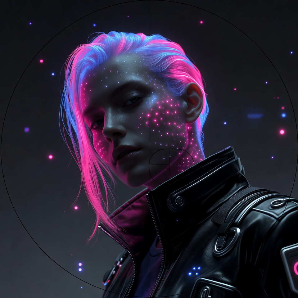
Why this Composition: Golden Ratio
Golden ratio composition is how you make cyberpunk look designed:
- Priority mapping: it places the eye-line, catchlight, or key glow node on a naturally pleasing path.
- Controlled complexity: neon can be visually loud; golden ratio organizes it into a hierarchy.
- Brand readiness: it reads like art direction rather than random “cool lighting.”
A practical mental model: the brightest glow accent should land near a golden-ratio focal region, with secondary neon gradients supporting it not competing.
4. Color Palette & Aesthetics
Suggested Color Palette: Neon Cyan + Magenta + Deep Indigo
- Cyan for futuristic clarity
- Magenta for editorial impact
- Indigo/near-black for contrast discipline (the “professional” anchor)
Textures to expect (and encourage):
- Gloss-to-matte contrast (sleek fabric, subtle skin sheen)
- Fine atmospheric haze for emissive diffusion
- Micro “tech” texture: brushed metal, polymer, clean glass (minimal, not cluttered)
5. Pro Tips for Refinement
Tip 1 (Stylization / glow discipline):
- Midjourney:
- If glow blooms too much or skin becomes plastic: drop to
--stylize 100–175and add “controlled bloom, preserved highlights.” - If it looks too plain: raise to
--stylize 300–450and add “cinematic neon noir,” but watch for blown edges.
- If glow blooms too much or skin becomes plastic: drop to
- Stable Diffusion:
- For clean professionalism:
cfg_scale ~ 5–7. - If emissive accents overpower the face, lower CFG slightly and add “subtle bioluminescent accents, not overpowering.”
- For clean professionalism:
Tip 2 (Subject + styling that reads “Professional Cyberpunk”):
- Wardrobe: structured silhouettes (blazer, high collar, minimalist techwear) in dark neutrals with one emissive accent.
- Makeup: controlled highlight, crisp liner; avoid heavy glitter (it can turn into noisy hot pixels).
- Expression: calm, focused gaze professional presence with cyberpunk atmosphere.
6. FAQ (Rich Snippet Optimized)
Q: Can I use this prompt for “Cyberpunk Street” instead of Professional?
A: Yes swap “Professional” for “gritty street style” and add “wet pavement reflections, urban signage,” while keeping golden ratio to avoid visual clutter.
Q: What creates the Professional feeling in this shot?
A: Professionalism comes from disciplined exposure (preserved highlights), organized hierarchy (golden ratio), and clean emissive accents (bioluminescent glow that supports rather than overwhelms the face).