1. The Artistic Vision
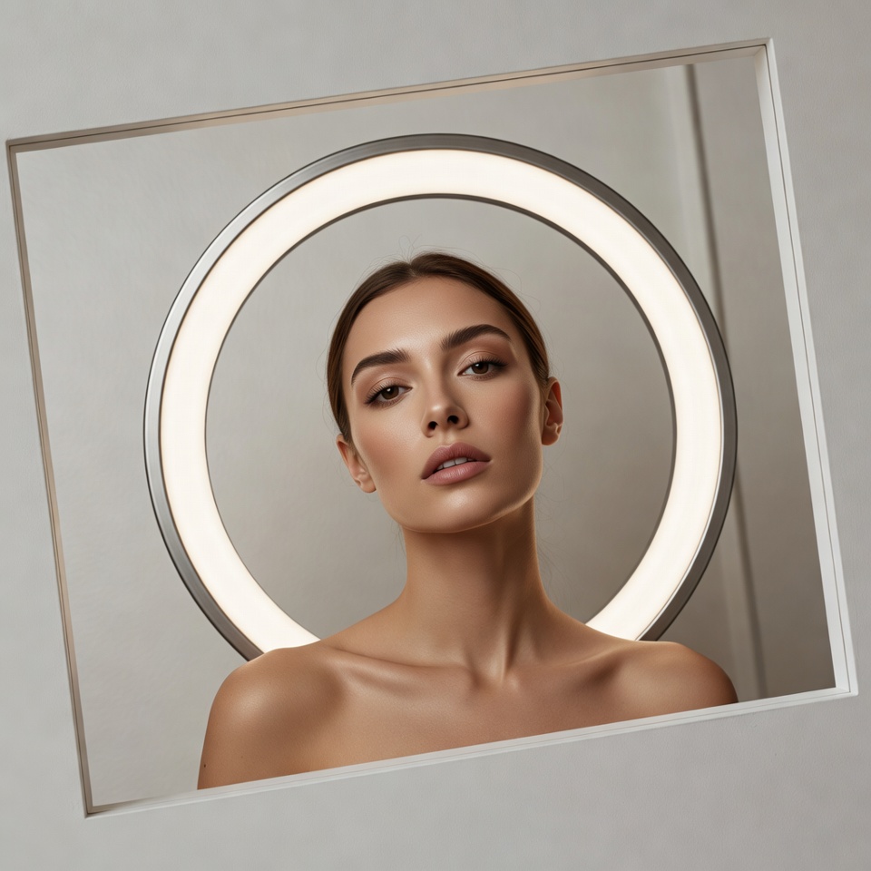
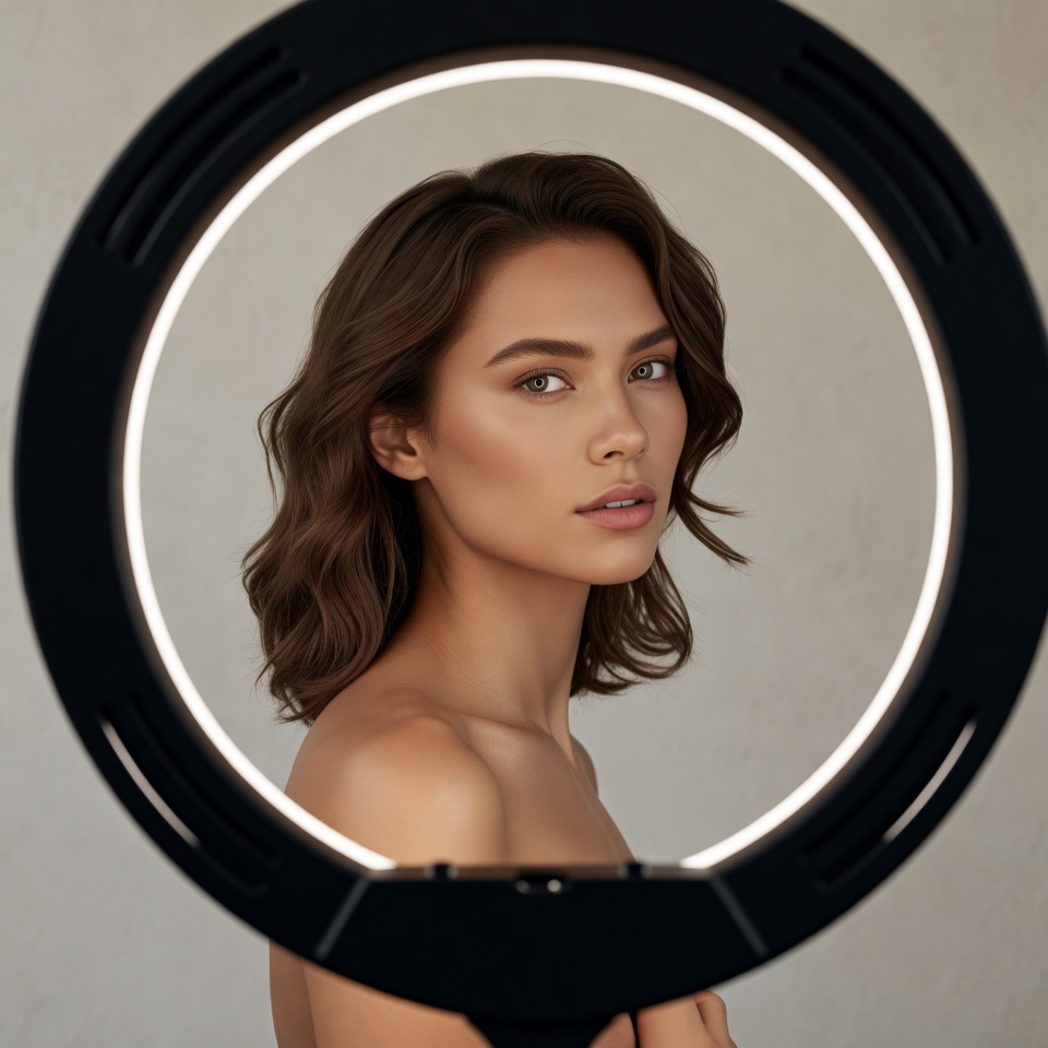
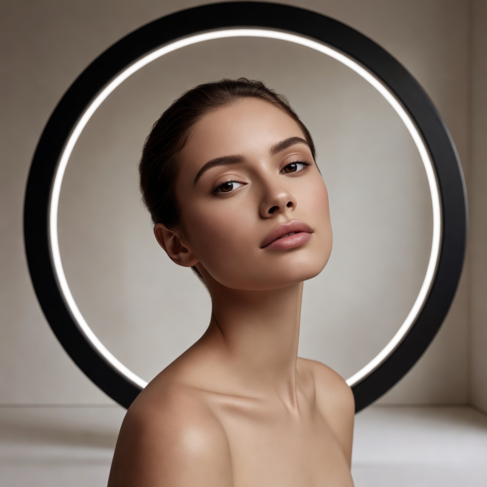
A Beauty Headshot is normally about stability: clean geometry, flattering symmetry, and controlled highlights. A Studio Ring Light reinforces that with an unmistakably modern signature uniform illumination, crisp catchlights, and makeup that reads expensive rather than dramatic.
So why introduce a Dutch Angle in a Professional setup?
Because it adds editorial authority without breaking polish. The tilt injects energy into an otherwise “perfect” lighting scheme, creating a subtle sense of motion and confidence like a high-end campaign where the subject is unbothered, the lighting is clinical, and the composition is intentionally assertive. Add Frame within a Frame, and the image becomes brand-ready: it feels designed, curated, and art-directed rather than simply “well lit.”
2. The Master Prompt (Copy-Paste Ready)
Midjourney / Stable Diffusion Formula:
3. Anatomy of the Shot (Technical Deep Dive)
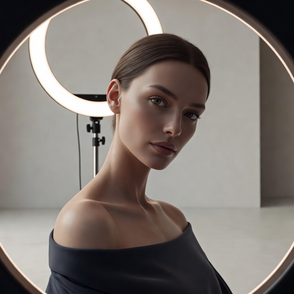
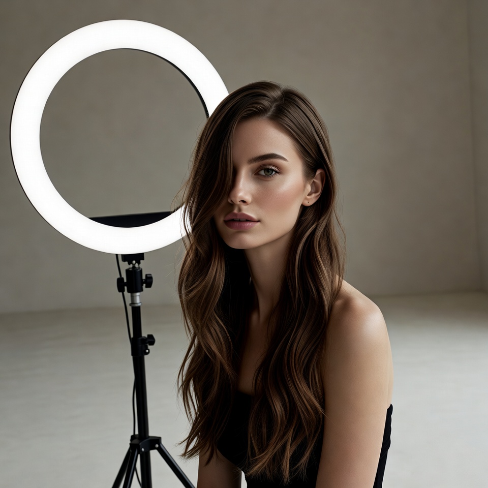
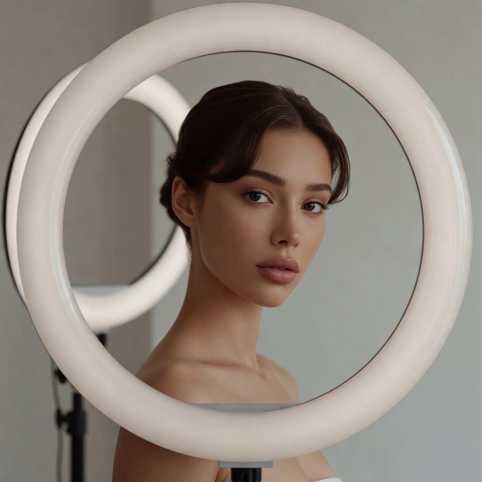
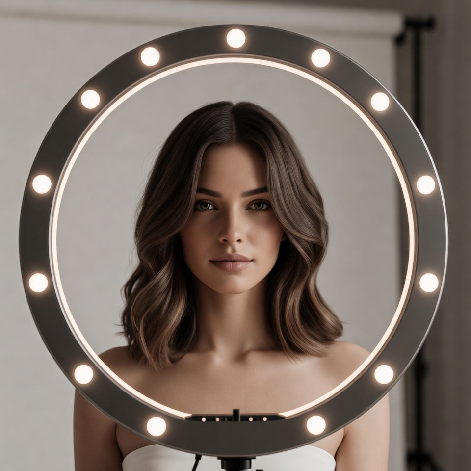
Why this Lighting: Studio Ring Light
Ring light is prized in beauty because it minimizes ugly shadows and maximizes detail:
- Near-axis illumination (light close to camera lens) reduces facial shadowing, keeping skin smooth and evenly exposed.
- Signature catchlights: circular highlights in the eyes immediately read as “studio.”
- Makeup fidelity: eyeliner edges, lip contours, and complexion work are rendered with high clarity ideal for professional portfolios and brand content.
What to watch: Ring lights can over-flatten facial structure. To preserve professional sculpting, your best outputs will imply a slight off-axis bias or subtle negative fill (dark flag) so cheekbones don’t disappear into uniform glow.
Why this Angle: Dutch Angle
A Dutch angle tilts the horizon line, changing the psychological read:
- Adds kinetic confidence (editorial, modern, platform-native).
- Signals intention: it looks art-directed, not accidental.
- In a professional context, the key is moderation think 5–12° tilt, not extreme diagonal chaos.
This is the difference between “creative corporate portrait” and “thriller poster.” The ring light keeps the subject credible; the dutch angle keeps the image memorable.
Why this Composition: Frame within a Frame
In beauty, framing must be clean and structural:
- It creates hierarchy: outer frame sets context, inner frame isolates the face.
- It increases “designedness” (very professional for ads, profiles, and campaigns).
- It provides a way to control the dutch angle: the frame edges become intentional diagonals that guide the viewer’s eye.
Best frame candidates for a professional beauty look:
- a mirror edge (vanity mirror / circular mirror echoing the ring light),
- a window frame with soft diffusion,
- a geometric cutout (arch, rectangle, acrylic panel).
4. Color Palette & Aesthetics
Recommended Color Palette: Clean Neutrals + Soft Contrast
- Ivory / off-white background for premium minimalism
- Warm beige skin-true midtones
- Charcoal accents (wardrobe, frame element) to anchor the tilt
Textures to expect (and encourage):
- Natural skin texture (avoid “plastic” smoothing)
- Gloss + satin highlights (lip gloss, subtle highlighter)
- Polished acrylic / glass for the frame element (modern studio vibe)
- Optional: micro film grain only if you want “editorial,” not “commercial clean”
5. Pro Tips for Refinement
Tip 1 (Stylization / Realism Control):
- Midjourney:
- For true professional headshot realism, lower stylization:
--stylize 75–150. - If it becomes too sterile, increase to
--stylize 250–350and add “editorial campaign” to keep it premium.
- For true professional headshot realism, lower stylization:
- Stable Diffusion:
- Keep faces consistent with
cfg_scale ~ 4.5–7. - If the dutch angle bends facial proportions, reduce CFG slightly and add “natural proportions, realistic facial geometry” (already included, but reinforcing helps).
- Keep faces consistent with
Tip 2 (Subject Matter that reads “Professional”):
- Neutral wardrobe: black, white, camel, slate (avoids color cast fights with ring light).
- Makeup: clean skin, defined brows, controlled highlight, minimal glitter.
- Expression: “professional” works best as calm confidence relaxed mouth, focused gaze, subtle intensity.
6. FAQ (Rich Snippet Optimized)
Q: Can I use this prompt for Corporate Headshots?
A: Yes swap “Beauty Headshot” for “Corporate headshot” and reduce the dutch angle intensity (aim for subtle tilt) while keeping ring light for clean clarity.
Q: What creates the Professional feeling in this shot?
A: Professionalism comes from controlled, even exposure (ring light), clean minimal background, and structured composition (frame within a frame). The dutch angle adds modern editorial energy without sacrificing polish when kept subtle.